
The Impact of Color Psychology on Your Banner Designs
Posted by Arrowhead Signs & Displays on Feb 25th 2025
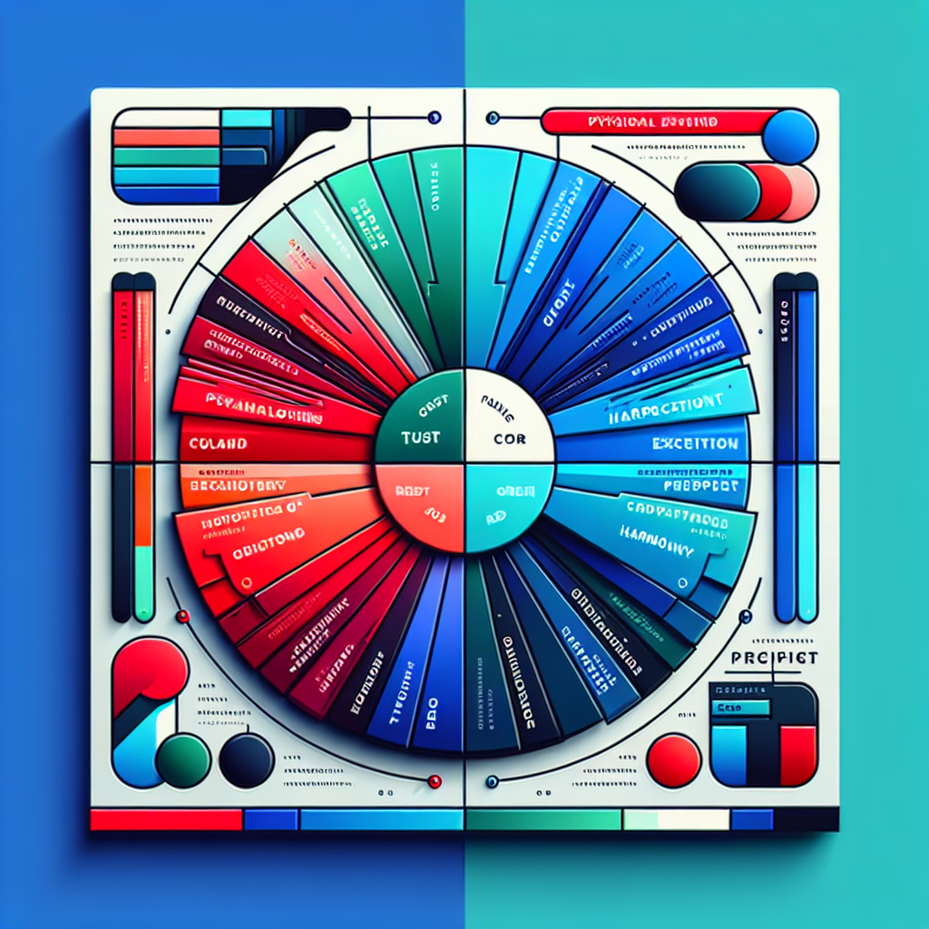
Understanding Color Psychology
Color psychology is the study of how colors affect perceptions and behaviors. Different colors evoke specific emotions and can influence decisions in a profound way. When designing banners, it’s crucial to understand the emotional impact of color on your audience.
The Basics of Color Meaning
- Red: Often associated with energy, passion, and action, red can create a sense of urgency. It’s an effective color for sales promotions but should be used sparingly to avoid overwhelming the viewer.
- Blue: Symbolizing trust and professionalism, blue is a popular choice for corporate branding. It conveys a sense of calm and reliability, perfect for banners that promote financial services or healthcare.
- Green: Associated with growth, health, and nature, green is an excellent choice for eco-friendly products or health-related services. It encourages relaxation and is easy on the eyes.
- Yellow: This cheerful and optimistic color grabs attention and can stimulate mental activity. However, too much yellow can cause anxiety, so balance is key when using it in banner designs.
- Black: Denoting elegance and sophistication, black can lend a sense of authority and luxury. It works well for high-end products and services.
- Orange: A blend of red and yellow, orange encourages enthusiasm and creativity. It’s often used in calls to action, making it effective in driving conversions.
Implementing Color in Your Banner Designs
Choosing the right color scheme for your banner is crucial. Here are some tips to apply color psychology effectively:
1. Know Your Audience: Consider the demographics and preferences of your target audience. What colors resonate with them? For instance, millennials may gravitate towards vibrant colors, while older audiences might prefer softer tones.
2. Brand Consistency: Ensure that the colors used in your banners align with your overall brand colors. Consistency builds recognition and reinforces brand identity.
3. Contrast for Legibility: While it’s important to choose colors that evoke the right emotions, ensure that they also allow for easy readability. High contrast between text and background colors makes information more accessible.
4. Use Color to Draw Attention: Employ brighter colors to highlight key messages or calls to action. For example, a pop-up display advertising a special promotion could use a vibrant font against a more muted background to make it stand out.
5. Test Your Color Choices: Don’t hesitate to test out different color combinations to see what resonates best with your audience. A/B testing can help you determine which color scheme brings the best results.
Conclusion
As you conceptualize your banners, remember that color is not just a decorative element – it’s a powerful component that can influence perceptions and drive actions. By understanding the principles of color psychology, you can enhance the effectiveness of your promotional vinyl signs, show banners, pop-up displays, and banner stands.
At our company, we have been helping businesses make a statement with custom designs and quality products for over 26 years. Harness the magic of color psychology in your next design, and watch your promotional efforts reach new heights!