

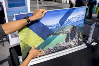
Why Display Quality Shapes Brand Perception at Every Touchpoint
Posted by Deeder Dandenhorf on Aug 19th 2026
Why Display Quality Shapes Brand Perception at Every Touchpoint
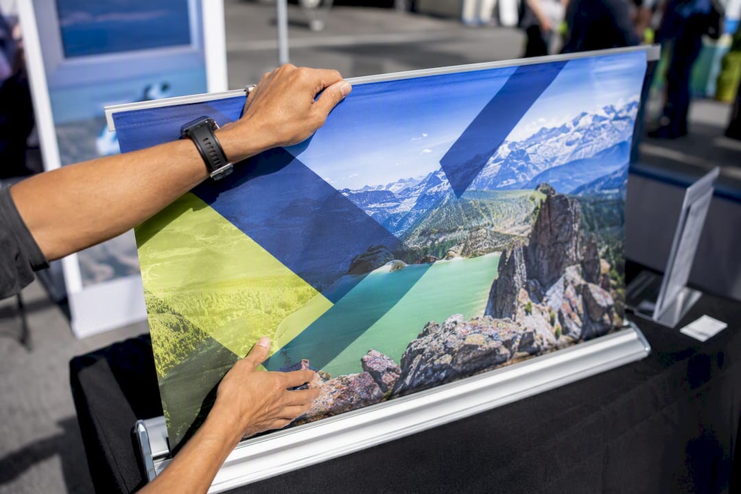
High image and display quality do one thing consistently: they raise how consumers judge product quality, seller credibility, and overall brand attitude, even before a single word of copy gets read. That effect shows up in controlled lab experiments and in real sales data from storefronts and trade show floors alike. The mechanism is simple to state and harder to execute: people use what they see as a stand-in for what they can’t yet verify.
Two findings anchor this. In a controlled advertisement experiment, participants exposed to higher-quality video reported significantly more immersion and more positive brand attitudes, with the brand-attitude effect showing strong statistical significance. Separately, field research on physical signage found that upgrading or adding on-premise signs can lift a location’s sales revenue by roughly 5% to 15%, depending on the sign type.
The pattern holds across channels:
- Online product pages: sharper, better-composed images increase perceived product quality and seller trust.
- Video and streamed ads: higher image quality drives measurable gains in immersion and brand favorability.
- Physical signage and trade show booths: display quality functions as the first, and sometimes only, credibility signal a prospect gets before deciding to engage.
Businesses that sell in person, including exhibitors working with a resource like Arrowhead Sign Company - Signs, Banners and Trade Show Displays, deal with this dynamic constantly. A booth’s fabric tension, print resolution, and lighting are read by attendees the same way a shopper reads a product photo: as data about how seriously the business takes itself.
Key Takeaways
Display and image quality function as a direct, measurable input into perceived brand credibility, not a cosmetic afterthought layered on top of marketing strategy.
| Point | Details |
|---|---|
| Quality drives credibility | Higher image and display quality reliably raise perceived product quality, seller credibility, and brand attitude in controlled studies. |
| Fix resolution and lighting first | Low resolution and poor lighting undermine even well-designed products and packaging, so address them before layout or messaging. |
| Signage moves real sales | Field research ties on-premise signage upgrades to sales increases of roughly 5% to 15%, depending on sign type. |
| Match complexity to positioning | Curated minimalism or intentionally detailed visuals read as higher status than cluttered, middling designs. |
| Trade shows demand fast execution | Arrowhead Sign Company - Signs, Banners and Trade Show Displays supports rapid-turnaround booth materials, including fabric displays, outdoor banner frames, and A-frame signs, for exhibitors working against tight event timelines. |
Table of Contents
- Why Display Quality Affects Brand Perception So Directly
- What Makes People React to Better Visuals?
- Where Does Display Quality Matter Most for a Brand?
- How Do You Measure the Return on Better Visuals?
- What Should Marketers Prioritize First?
- Making Trade Show Displays Work as Hard as Your Booth Staff
- What I’ve Learned Watching Brands Get This Wrong
- A Faster, More Reliable Way to Upgrade Your Display Quality
- Sources
- FAQ
Why Display Quality Affects Brand Perception So Directly
Display quality affects brand perception because visual cues serve as a substitute for information consumers don’t have time to gather any other way. When someone can’t touch a product, talk to a rep at length, or research a company’s history mid-decision, they lean on what’s in front of them: how crisp the image is, how clean the signage looks, how considered the layout feels.
This isn’t a soft or subjective phenomenon. It shows up as a repeatable statistical pattern. In the telepresence study cited above, researchers ran a controlled comparison of high versus low image quality and found brand attitude differences significant at t = 3.47 (df = 126, p = 0.001), alongside comparable results for immersion and spatial presence. That’s not a marginal nudge. It’s evidence that image fidelity operates as a direct lever on how favorably people regard a brand, not just a cosmetic upgrade.
A second body of research digs into why image quality matters and where it stops mattering. Work on visual biasing effects found that more visually appealing product images lead to higher perceived product quality and stronger seller credibility, and that shoppers exposed to appealing visuals become more selective about which customer reviews they read afterward. In plain terms: a good photo doesn’t just make the product look better. It changes how forgiving people are toward everything that comes next, including negative reviews.
That same research offers an important caveat. Image quality’s effect on brand attitude isn’t always direct. It frequently runs through perceived product quality and seller credibility as mediators, and low-resolution images can actively undercut an otherwise well-designed product or package. A gorgeous label photographed poorly will underperform a mediocre label photographed well.
Where the evidence gets interesting is at the storefront level. Field studies compiled by the Signage Foundation found that many survey respondents said signage helps them locate a business, and a notable share discovered a service specifically because of signage they noticed while passing by. That’s not brand perception in the abstract. That’s revenue walking in the door because a sign did its job.
Three practical implications follow from this evidence:
- Fix resolution before anything else. Low resolution undermines every other design decision downstream, from package appeal to layout.
- Lighting is not a finishing touch. Poor lighting in photography or booth setups reads to viewers as low investment, regardless of the underlying product quality.
- Expect variable results on purchase intent. Image quality reliably moves brand attitude and perceived credibility; its effect on purchase intention is more conditional, shaped by product type and how much telepresence the format allows, according to the same image-quality study.
Separately, richer, more media-heavy product presentations, including video and interactive 360-degree views, tend to raise perceived value and purchase intention in online retail settings, though that effect is moderated by time pressure and platform. A shopper in a hurry doesn’t benefit from a slow-loading 360 viewer the same way a browsing shopper does.
What Makes People React to Better Visuals?
You don’t need a psychology degree to use these mechanisms, but knowing them changes what you fix first. Four forces do most of the work.
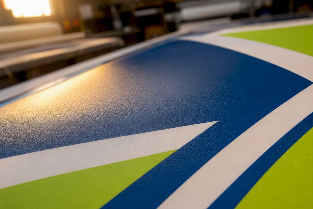
Processing fluency is the ease with which your brain takes in information. High-resolution, well-composed visuals are simply easier to process, and that ease gets misread as a positive judgment about the thing itself. A 2021 factorial experiment on package design and image quality, with over 400 participants, found that arousal and fluency mediated the relationship between product visuals and brand attitudes. Fluent visuals don’t just look nicer; they generate a small, real emotional lift.
Telepresence and immersion matter most when the format allows the viewer to feel “inside” the experience, like video or a well-lit booth walkthrough. Higher image quality raises reported immersion, and immersion in turn raises brand attitude, per the telepresence study referenced earlier. This is why a grainy product video underperforms even when the product itself is identical to one shown in crisp footage.
Inferential heuristics are the shortcuts people use when they lack direct information. A shopper who can’t test a product in person defaults to a simple rule: sharp visuals mean a serious business, and sloppy visuals mean cut corners. Extrinsic cues like display quality become stand-ins for intrinsic qualities the viewer can’t check.
Confirmation bias kicks in after the first impression forms. The visual biasing research found that consumers exposed to appealing visuals become more selective about which reviews they seek out afterward, effectively protecting the positive impression the image created. That’s a double-edged finding: strong visuals help, but they can also mask real product issues until a customer discovers them after purchase.
A simple way to picture the chain: visual cue leads to fluency or immersion, which leads to inferred quality or credibility, which leads to behavioral intent, whether that’s clicking “add to cart” or walking into a booth.
Pro Tip: Run your product photos or booth mockups past someone unfamiliar with the brand and time how long it takes them to form a first impression. If it takes more than a few seconds to register “professional” versus “amateur,” your visual fluency needs work before you touch copy or pricing.
Where Does Display Quality Matter Most for a Brand?
Not every channel deserves equal investment, and stretching a limited budget evenly across all of them is a mistake. Prioritize by how much the format substitutes for direct interaction.
- Online product pages and marketplaces carry the heaviest burden. Shoppers can’t touch anything, so resolution, multiple angles, and zoom or 360 functionality do the convincing that a salesperson would otherwise do in person.
- Video and streamed ads reward higher bitrate and cleaner footage with measurably stronger immersion and brand attitude, though bandwidth constraints on some platforms can force compromises worth testing rather than assuming.
- Storefronts and in-store signage shape first impressions before a customer ever crosses the threshold, and field data ties sign quality directly to unplanned visits and location awareness.
- Trade show booths and event displays operate under time pressure. Attendees walk past hundreds of exhibitors in an afternoon, so material finish, fabric tension, and legible messaging carry more weight per second of attention than almost any other channel.
- Digital signage adds its own technical layer: refresh rate, contrast, and appropriate sizing for viewing distance all determine whether a screen looks premium or looks like a malfunctioning kiosk.
The common thread is interaction quality. The less time or access a consumer has to evaluate a brand directly, the more the visual substitutes for everything else, an insight backed by research on rich media presentation formats in online retail.
How Do You Measure the Return on Better Visuals?
Better visuals are worth budget only if you can prove it, and proving it requires picking the right metrics before you start, not after.
Five KPIs cover most use cases: conversion rate, average order value, dwell time, unplanned visit rate, and net promoter score or brand favorability. Trade show teams should add trial and sample uptake, since booth visuals often exist to earn a few seconds of engagement rather than an immediate sale.
Testing this rigorously means running a real experiment, not just a gut-check redesign:
- Pick one variable to change (image resolution, lighting, or layout) and hold everything else constant.
- Set a sample size large enough to detect a meaningful difference. Most consumer-behavior experiments run comparisons with well over 100 participants per condition to get reliable t-test results.
- Run the A/B test for a defined window, then compare conversion or dwell time using a basic t-test or chi-square test depending on whether your outcome is continuous or categorical.
- For physical signage, compare matched locations with staggered rollouts and track footfall and sales for four to twelve weeks after the change, a protocol supported by telepresence research methodology.
- Report the effect size, not just statistical significance. A significant result with a tiny practical lift isn’t worth a budget increase.
Field data gives you a benchmark to test against. On-premise signage upgrades have produced sales uplifts in the 5% to 15% range depending on sign type, with directional signage adding closer to 10% in some studies. Treat that band as a target worth beating, not a guarantee.
| KPI | Measurement method | Typical effect range | Recommended test cadence |
|---|---|---|---|
| Conversion rate | A/B test high vs. low resolution images | Varies by product category | 2 to 4 weeks per test |
| Sales uplift (signage) | Matched-store, staggered rollout | 5% to 15% | 4 to 12 weeks post-change |
| Brand attitude | Pre/post survey or intercept | Statistically significant in controlled studies | Per campaign cycle |
| Dwell time / video completion | Analytics or on-site observation | Leading indicator, not standardized | Ongoing |
Pro Tip: Track telepresence proxies like time spent on a video ad or completion rate as early warning signs. These move before brand attitude scores catch up, giving you a faster read on whether a creative change is working.
What Should Marketers Prioritize First?
Not every fix costs the same, and not every fix needs to happen at once. Sequence the work by return and difficulty.
Quick wins come first: raise image resolution across your existing product catalog and fix obviously poor lighting in current photography or booth setups. Neither requires new equipment, just better execution of what you already have.
Medium-term work covers composition and brand consistency: standardizing angles across a product line, aligning color palettes with brand guidelines, and making sure every touchpoint, from web to booth to signage, looks like it belongs to the same company.
Longer-term investment goes toward visual complexity optimization. Research on brand status found that edge complexity has a U-shaped relationship with perceived status, meaning very simple or intentionally intricate designs read as higher status than middling, cluttered ones. Color complexity, by contrast, showed a consistent negative effect on perceived status. If your brand leans upscale, that’s a strong argument for curated minimalism over busy, unedited visuals.
Technical standards matter more than most teams admit. For web use, images should run at least 72 DPI at full display size, though many ecommerce platforms now expect assets closer to 150 DPI for retina displays. Print materials, including trade show graphics, typically need 150 to 300 DPI depending on viewing distance. Use consistent color profiles across your files so a banner printed by one vendor doesn’t clash visually with signage produced elsewhere.
Design rules worth locking in as policy:
- Keep visual complexity intentional. Either commit to clean minimalism or fully-realized detailed artwork; avoid the uncurated middle ground.
- Limit color palettes on premium-positioned products and signage, since color complexity tends to read as less exclusive.
- Standardize lighting setup for product photography and booth walk-throughs so quality doesn’t vary shoot to shoot.
- Match visual polish to brand positioning. A discount retailer doesn’t need the same visual investment as a luxury exhibitor, and overspending on polish for a value brand can create dissonance rather than trust.
Channel-specific checklists keep this from becoming abstract:
- Ecommerce image sets: minimum resolution standard, multiple angles, a lifestyle shot, and a scale reference.
- Trade show booth visuals: high-resolution print files, wrinkle-free fabric or rigid panels, and legible messaging from at least 15 feet away.
- Ad and video encoding: highest bitrate the platform allows, tested playback on mobile before launch.
- Storefront signage maintenance: a quarterly check for fading, cracking, or outdated branding.
Assign a single owner for visual quality audits rather than leaving it to whoever has time. Set a recurring schedule (quarterly works for most retail and ecommerce brands), define minimum sample sizes before running any A/B test, and set a budget rubric that ties spend to expected traffic or foot count, since a $3,000 signage upgrade makes sense for a high-traffic location and little sense for a low-traffic side street.
Pro Tip: Before rolling out a visual overhaul company-wide, pilot it at a single store or on a single high-traffic product page for two to four weeks. Compare it against a matched control before committing budget to a full rollout. This is the same staggered-rollout logic field researchers use to isolate a signage change from seasonal noise.
Consumers across age groups and cultural backgrounds respond to visual fluency, but the intensity varies. Younger, digitally native shoppers tend to move faster and judge visuals in seconds, making resolution and mobile optimization non-negotiable. Older consumers and B2B buyers researching a purchase over multiple sessions weigh consistency across touchpoints more heavily than any single flashy image. Positioning matters too: a luxury brand pays a steeper reputational price for a low-quality visual than a budget brand does, since polish is part of what luxury customers are paying for in the first place. Overinvesting in visual production has real limits, however. Past a certain point, incremental resolution or production value stops moving perception, and the marginal dollar is better spent on messaging clarity or distribution than another lighting upgrade. Emerging display technologies, including higher-refresh digital signage and interactive touchscreens, are raising the baseline of what counts as “acceptable” quality, which means yesterday’s good-enough booth graphic may look dated next to newer exhibitors sooner than teams expect.
Making Trade Show Displays Work as Hard as Your Booth Staff
A trade show floor is the purest test of display quality’s power because interaction time is scarce. Attendees form judgments walking past a booth in three to five seconds, long before a rep says a word. That’s telepresence and processing fluency compressed into almost no time at all, which makes material finish, print sharpness, and layout the entire pitch.
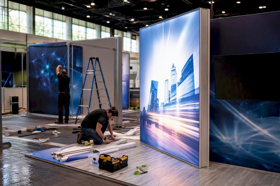
Vendor selection matters as much as design. Look for a provider offering strong print resolution, durable material finish, straightforward setup, and realistic turnaround. Arrowhead Sign Company - Signs, Banners and Trade Show Displays built its process around most orders shipping within two business days, with direct venue delivery available for Arizona-based exhibitors, which matters when a booth graphic gets finalized closer to the show date than anyone planned.
A practical booth checklist:
- Print resolution high enough to stay sharp at a 10 to 15 foot viewing distance.
- Fabric or rigid material that resists wrinkling or warping during setup and transport.
- Messaging legible from the aisle, not just up close.
- A setup process your team can execute in under 30 minutes without a manual.
Product choice should follow use case, not just budget. A 10 ft stretch fabric display gives a booth a clean, wall-sized backdrop that reads as high-production-value from across a hall. The Outdoor Banner Frame from The Banner Bar handles outdoor or perimeter promotion where wind and weather rule out fabric alternatives. The Signicade Deluxe A-Frame Sidewalk Sign earns its place at entrances and sidewalks, directing foot traffic before attendees ever reach the main booth. One exhibitor running a two-day regional expo reported that adding clear directional signage near the venue entrance measurably increased walk-in traffic compared to previous shows without it, echoing the awareness effects found in signage field research.
As a rough procurement rule, reserve premium materials for anything viewed at a distance or used repeatedly across shows, and save mid-tier options for single-use, close-proximity items where the cost-to-impact ratio favors economy.
Pro Tip: Order booth graphics at least two weeks before a show, even with fast turnaround available. That buffer protects you if artwork needs a last-minute fix without forcing a rush fee or a compromised print.
What I’ve Learned Watching Brands Get This Wrong
The biggest mistake I see is treating display quality as an aesthetic decision instead of a measurement problem. Teams will agonize over whether a booth graphic “feels premium enough” while never once tracking whether the redesign changed foot traffic, dwell time, or lead capture. Aesthetic judgment without a KPI attached is just an expensive opinion.
The second mistake is inconsistency. A brand will invest heavily in one flagship touchpoint, like a hero product photo, while letting everything else, secondary images, signage, follow-up materials, lag years behind in quality. Consumers don’t experience your brand as a single hero shot. They experience it as a sequence, and one weak link undercuts the strong ones around it.
Vendor readiness matters more than most marketing plans account for. A booth design is only as good as the timeline that gets it printed, shipped, and set up correctly before doors open. Build in a buffer, run a small pilot before a full rollout, and never approve a visual change without deciding in advance how you’ll measure whether it worked.
A Faster, More Reliable Way to Upgrade Your Display Quality
Every checklist in this guide points toward the same bottleneck: good intentions get derailed by slow production timelines and materials that don’t hold up under real-world handling. Arrowhead Sign Company - Signs, Banners and Trade Show Displays exists to remove that bottleneck, shipping most orders within two business days and delivering directly to venues for Arizona-based exhibitors who need a booth ready without chasing a freight company.
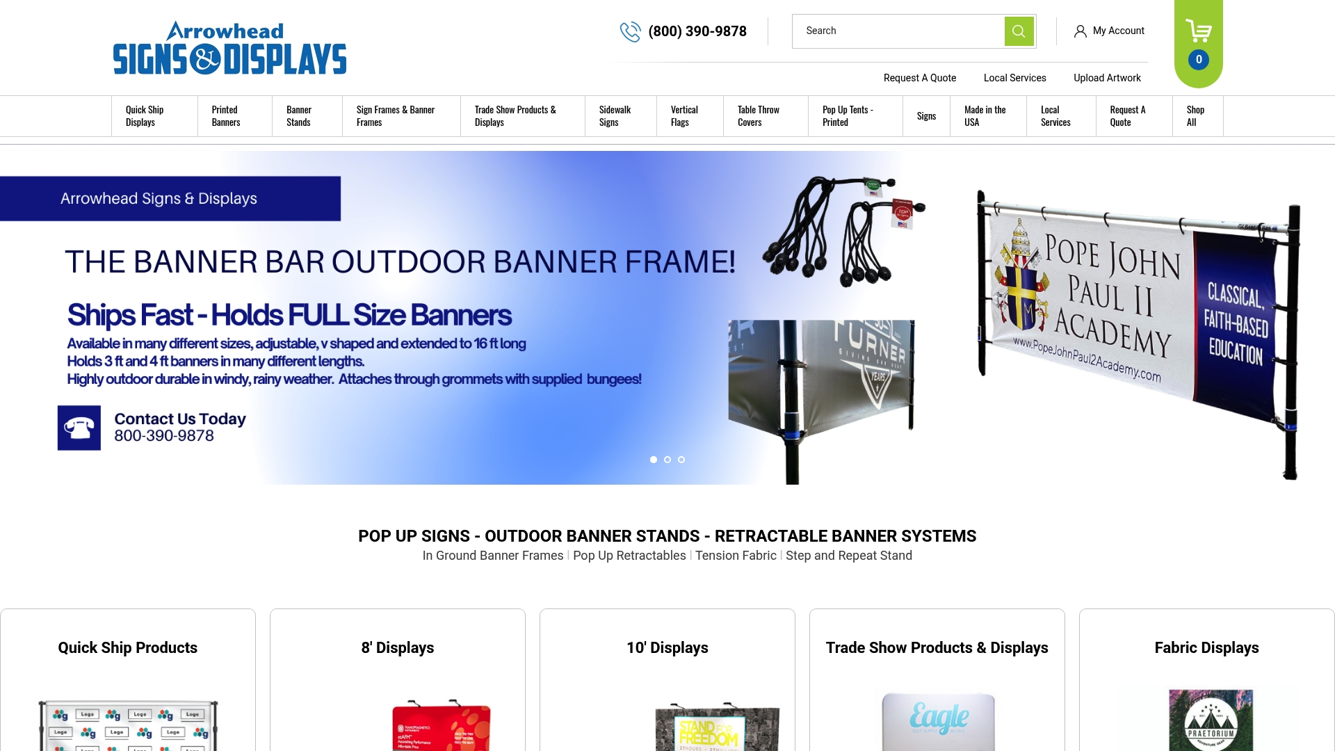
If your next show needs a backdrop that reads as high-production from across the hall, the 10 ft stretch fabric display delivers that wall-sized presence without the setup headache of rigid panel systems. For outdoor promotions or perimeter visibility where wind and weather are a factor, the Outdoor Banner Frame from The Banner Bar holds up where fabric alternatives won’t. And for directing foot traffic at entrances or sidewalks, the Signicade Deluxe A-Frame Sidewalk Sign does the quiet work of getting attendees to your booth in the first place.
Browse the full signage and display lineup to match a product to your next event, and place your order with enough lead time to use that two-day fulfillment window as a buffer, not a rescue plan.
Sources
- How visual complexity signals brand status | Journal of the Academy of Marketing Science
- Investigating the impact of television advertisement image quality on telepresence, attitude towards brands and purchase intentions
- Product presentation formats and consumer responses in online shopping (Frontiers in Psychology, 2023)
FAQ
What is brand perception?
Brand perception is how consumers interpret and evaluate a company based on the cues available to them, including visuals, messaging, and past experience, and it shapes trust and purchase decisions before any direct interaction happens.
How does store image affect customer perception of retail stores?
Store image, including signage quality, lighting, and layout, functions as a credibility signal. Field research shows improved on-premise signage increases location awareness and can lift sales by roughly 5% to 15%, depending on the sign type.
Does image quality actually matter for online sales?
Yes. Higher image quality increases perceived product quality and seller credibility in controlled studies, though its effect on purchase intent is more conditional and depends on product type and how immersive the format is.
What is the 3-7-27 rule of branding?
Definitions of this rule vary across marketing sources, and it isn’t backed by the peer-reviewed research this guide draws on, so it’s worth treating any specific numeric claim about it with caution rather than as an established standard.
How can a small business improve trade show display quality without a huge budget?
Prioritize print resolution and lighting first, since both are inexpensive fixes with outsized impact, then invest in durable materials like fabric backdrops or outdoor banner frames from a fast-turnaround provider such as Arrowhead Sign Company - Signs, Banners and Trade Show Displays for the pieces attendees see from a distance.
Recommended
- Visual Marketing Display Best Practices: 2026 Guide - Arrowhead Sign Company
- Trade Show Brand Visibility Checklist for Exhibitors - Arrowhead Sign Company
- 2026 Trade Show Trend Display Ideas That Win Attention - Arrowhead Sign Company
- Why Post-Show Follow-Up Uses Signage to Drive Results - Arrowhead Sign Company