


Visual Marketing Display Best Practices: 2026 Guide
Posted by Deeder Dandenhorf on Jul 19th 2026
Visual Marketing Display Best Practices: 2026 Guide
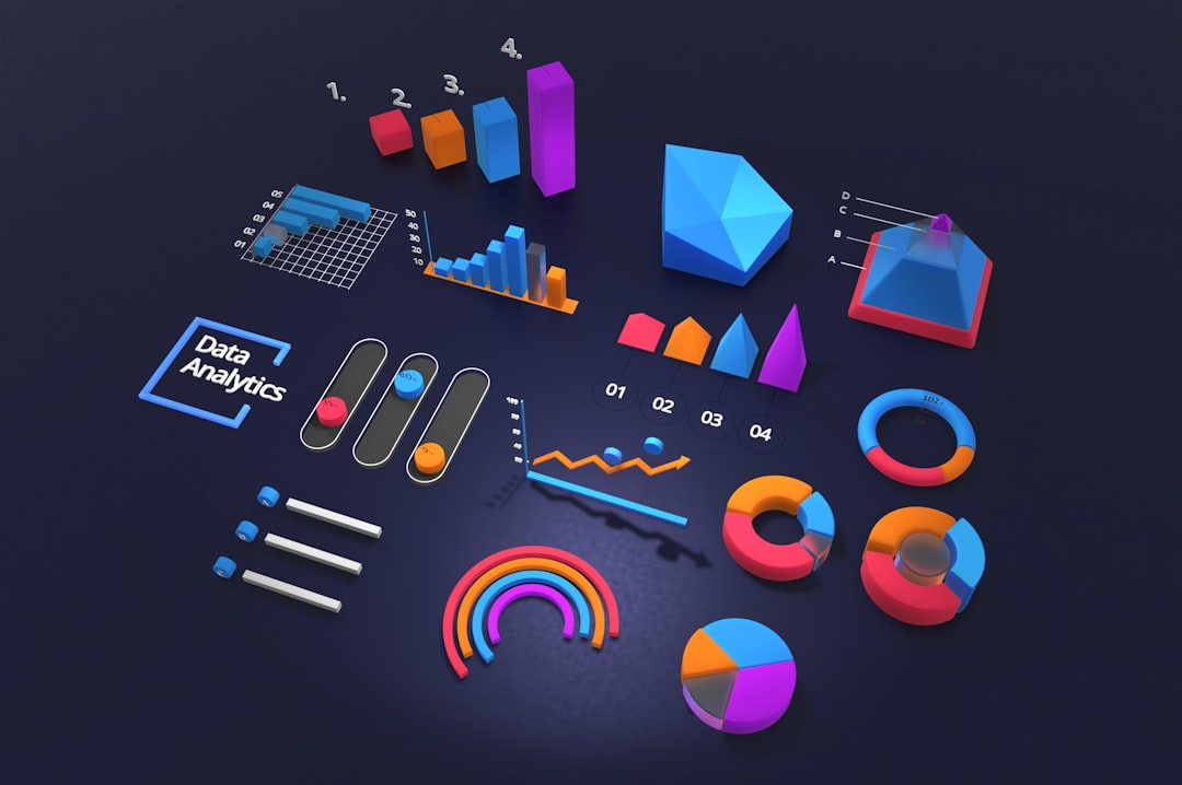
Visual marketing display best practices are defined as the strategic methods marketers use to capture attention, guide shoppers through a space, and convert interest into sales through well-designed visual presentations. The industry term for this discipline is visual merchandising, and it covers everything from focal point design and lighting temperature to technology-enabled displays and trade show booth layout. Research from 2026 confirms that technology-enabled displays drive measurable increases in emotional arousal and impulse buying. Whether you manage a retail floor, exhibit at expos, or run branded events, these principles apply directly to your results.
1. Visual marketing display best practices start with focal points
Focal points control attention by displaying one dominant element per zone. When you place too many competing elements in a single area, shoppers experience decision fatigue and move on without buying. The rule is simple: one zone, one hero product or message.
Sightlines matter as much as the focal point itself. Shoppers enter a space and their eyes follow a natural path, typically moving left to right and settling at eye level first. Designing your display around that natural flow reduces friction and keeps shoppers engaged longer.

The rule of three is the most reliable grouping technique in visual merchandising. Arrange products in groups of three at varying heights to create visual rhythm. A pyramid structure, with the tallest item at the back and shorter items stepping forward, draws the eye upward and then down to the products you want sold.
Negative space is not wasted space. Leaving breathing room around your hero product makes it feel more premium and easier to focus on. Overcrowded displays signal chaos, not abundance.
Pro Tip: Stand at your display’s entry point and close one eye. Whatever you see first is your focal point. If it is not your highest-margin product, rearrange until it is.
2. How lighting and color drive consumer attention
Accent lighting and ambient lighting serve different purposes. Ambient lighting sets the overall mood of a space, while accent lighting directs the eye to specific products. Spotlighting a mannequin or a hero product with warm, focused light increases the time shoppers spend looking at it.
Eye-tracking research shows that mannequins with realistic facial features and dynamic postures under warm spotlights receive faster initial fixation and longer gaze duration than static, abstract forms. That finding translates directly to any display where you want to hold attention: warm, focused light on a three-dimensional object outperforms flat, evenly lit shelving every time.
Color blocking is one of the most effective visual marketing strategies for grouping products and telling a brand story. Grouping items by color family creates instant visual order and makes a display feel intentional rather than random. Contrasting colors between your background and your product create the pop that stops foot traffic.
Lighting temperature varies by retail category. Warm tones (2700K–3000K) work well for fashion, food, and lifestyle products. Cool tones (4000K–5000K) suit electronics and medical products, where clarity and precision matter more than warmth.
Pro Tip: Avoid flat fluorescent lighting directly above your display. It flattens shadows, removes depth, and makes products look cheaper than they are. Use directional light sources instead.
3. Technology-enabled visual merchandising tools
Technology-enabled visual merchandising is the fastest-growing category in display strategy. A 2026 study found a strong positive correlation between technology-enabled displays and visual engagement (β = 0.58, p < 0.001), which then drives emotional arousal (β = 0.56, p < 0.001) that leads directly to impulse purchases. That is not a marginal effect. It is a structural shift in how shoppers respond to displays.
The main technology tools available to marketers today include:
-
Interactive touchscreens that let shoppers explore product variations, colors, and specs without needing staff assistance
-
Smart shelves with embedded sensors that track which products are picked up and for how long
-
Augmented reality (AR) displays that let shoppers visualize products in their own space before buying
-
Digital signage that updates content dynamically based on time of day, inventory levels, or promotional cycles
Placement strategy for tech-enabled displays follows the same logic as focal points. High-traffic zones near entrances and natural decision points (end caps, checkout areas) produce the highest engagement. Placing an interactive screen in a low-traffic corner wastes the investment.
| Technology Tool | Best Placement Zone | Primary Benefit |
|---|---|---|
| Interactive touchscreen | Entry zone or end cap | Product exploration without staff |
| Smart shelf | Mid-aisle product sections | Behavioral data collection |
| AR display | Fitting areas or demo stations | Purchase confidence |
| Digital signage | High-traffic corridors | Dynamic content updates |
Pro Tip: Technology novelty wears off fast. Pair every tech element with a clear emotional hook, a story, a lifestyle image, or a social proof message, so the display works even when the novelty fades.
4. How to plan display refreshes for lasting impact
Static displays kill repeat shopper engagement. A shopper who visits your store or booth twice and sees the same layout on the second visit has no reason to explore. Retailers who implement a rolling calendar with 4–6 week display rotations tied to analytics outperform those relying on seasonal inspiration alone.
The key shift is treating every display change as a controlled experiment. Before you rotate, record your baseline metrics: conversion rate, average basket value, and dwell time in that zone. After the change, measure the same metrics for the same period. That comparison tells you what actually worked, not what looked good in a planning meeting.
Stale displays also signal poor brand health to first-time visitors. If your signage looks sun-faded or your product groupings look picked over, shoppers assume the brand is struggling. Freshness is a proxy for quality in the shopper’s mind.
Audit metrics worth tracking for each display zone include conversion rate by zone, units sold per square foot, dwell time, and basket value for shoppers who engaged with that zone versus those who did not. These four numbers give you a complete picture of display performance without requiring expensive research tools.
5. Common visual marketing display mistakes to avoid
Overcrowding is the most common error in visual display design. Cluttered or competing elements confuse shoppers and hinder buying decisions. The fix is removing items, not rearranging them. If your display has more than five distinct product types in one zone, it has too many.
Staff placement at trade shows is a behavioral factor most marketers overlook. Reps standing at the booth front draw significantly more visitors than those seated behind tables. A table between your staff and the aisle creates a psychological barrier that reduces foot traffic without any change to your display design.
The 3-distance, 3-message rule is the standard for trade show display communication. Your display must communicate at 30 feet (brand identification), 15 feet (value proposition), and 3 feet (detailed information). Most exhibitors only design for the 3-foot view and miss the attendees who never get that close.
Other common mistakes and their corrections:
-
Too many promotional messages per display. Limit to one primary call to action per zone. Multiple competing messages cancel each other out.
-
Ignoring the decompression zone. The first 5–10 feet inside an entrance is where shoppers orient themselves. Placing product or signage there wastes prime real estate because shoppers are not yet ready to engage.
-
Poor sightline planning. Tall displays placed at the front of a booth or store block the view of everything behind them. Keep tall elements at the back and sides.
-
Inconsistent brand color use. Mixing too many colors across a display dilutes brand recognition. Stick to two or three brand colors per zone.
Key takeaways
Effective visual merchandising combines focal point design, strategic lighting, and technology-enabled displays to guide shoppers and drive measurable sales results.
| Point | Details |
|---|---|
| Focal points drive decisions | Place one dominant product or message per zone to reduce shopper confusion. |
| Lighting temperature matters | Use warm spotlights (2700K–3000K) on hero products to increase gaze duration. |
| Technology boosts impulse buying | Tech-enabled displays show a strong correlation with emotional arousal and unplanned purchases. |
| Rotate displays every 4–6 weeks | Treat each refresh as an experiment and track conversion rate and basket value. |
| Staff behavior affects display results | Standing reps at booth entrances outperform seated staff without any display change. |
What I’ve learned from watching great displays fail
The most common mistake I see from experienced marketers is over-investing in aesthetics and under-investing in shopper flow. A display can look stunning in a planning deck and completely fail on the floor because nobody mapped how a real shopper moves through the space.
Visual merchandising research confirms what I have observed directly: display quality builds emotional engagement, but it does not automatically justify higher prices or drive premium purchases. The implication is that your display’s job is to create connection, not to signal expense. That reframe changes how you allocate your display budget.
Technology tools are genuinely powerful, but I have watched brands install interactive screens and then neglect the content on them for six months. The hardware means nothing without a content refresh strategy. The same discipline that applies to physical display rotation applies to digital content cycles.
The detail most marketers skip is the decompression zone. Shoppers need a few seconds to orient when they enter a new space. Filling that zone with product or messaging is like talking to someone before they have taken off their coat. Give them space, then engage them.
My practical advice: run your display like a media channel. Set a publishing calendar, track performance metrics, and make changes based on data, not instinct. The brands that do this consistently outperform those that treat displays as a one-time creative project.
— Dan
Display solutions from Arrowhead Sign Company - Signs, Banners and Trade Show Displays
Putting these principles into practice requires the right physical tools. Arrowhead Sign Company - Signs, Banners and Trade Show Displays offers a range of products built for marketers who need impact without long lead times.
The 10 ft stretch fabric display delivers a clean, professional backdrop that supports strong focal point design at trade shows and events. For outdoor and pedestrian environments, the Signicade Deluxe A-Frame sign puts your message at eye level exactly where foot traffic flows. Arrowhead Sign Company - Signs, Banners and Trade Show Displays ships most products within two business days and provides direct delivery to venues across Arizona. Visit Arrowhead Sign Company to see the full product range and get your display ready before your next event.
FAQ
What is the most important rule for effective visual displays?
One focal point per zone is the foundational rule. Competing elements confuse shoppers and reduce buying decisions, so every display zone needs a single dominant product or message.
How often should you refresh a marketing display?
A 4–6 week rotation tied to promotional cycles and tracked with conversion metrics is the standard. Treating each refresh as a controlled experiment produces better results than seasonal changes alone.
Does technology in displays actually increase sales?
Yes. Research shows a strong positive correlation between technology-enabled visual merchandising and impulse buying, mediated by emotional arousal. Placement in high-traffic zones maximizes the effect.
What is the 3-distance rule for trade show displays?
The 3-distance, 3-message rule requires your booth to communicate brand identity at 30 feet, your value proposition at 15 feet, and detailed information at 3 feet to engage attendees at every stage of approach.
Does display quality justify charging higher prices?
No. Research with 385 shoppers found no significant link between display quality and willingness to pay premium prices. Display quality drives emotional engagement, not price acceptance.