

Retractable Banner Design Best Practices for Events
Posted by Deeder Dandenhorf on Jun 6th 2026
Retractable Banner Design Best Practices for Events
Retractable banner design best practices are the set of visual, typographic, and technical standards that determine whether your display captures attention or gets ignored on a crowded trade show floor. Effective banner design simplifies your message to one core idea and supports it with clear hierarchy and whitespace. The difference between a banner that generates leads and one that blends into the background comes down to decisions made before the file ever reaches a printer. This guide covers every layer of that process, from layout and typography to print file setup and common production mistakes.
What are retractable banner design best practices?
Strong retractable banner design starts with one principle: a viewer should understand your core message within three seconds from eight to ten feet away. That constraint shapes every decision you make about layout, font size, color, and content volume. Scaling artwork from small digital files to large-format print without adjusting typography and spacing is the most common design mistake in the industry. It produces banners that look fine on screen but fall apart at full size.
The industry term for this discipline is large-format display design, and it draws from both graphic design principles and print production knowledge. Retractable banners, also called pull-up or roll-up banner stands, are a specific format within that category. They stand between 33 and 36 inches wide and 78 to 84 inches tall, which creates a tall, narrow canvas that rewards vertical hierarchy and punishes clutter. Understanding those physical constraints before you open a design file is the first retractable banner tip that separates professionals from beginners.
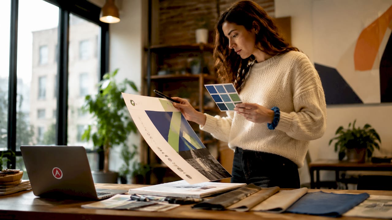
Three named entities define the standard toolkit for this work: Adobe Illustrator for vector-based layouts, Adobe Photoshop for image preparation, and Canva for teams without dedicated design staff. Each handles the format differently, and your choice affects how you manage resolution, bleed, and color profiles.
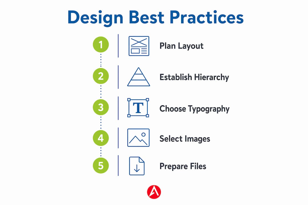
How to establish strong visual hierarchy and message clarity
Visual hierarchy on a retractable banner means placing your most important message at eye level and letting every other element support it without competing. The top third of the banner draws the most attention because it sits at or above eye level for most viewers. Your brand name or headline belongs there, set in the largest type on the display.
Here is how to build a clear hierarchy from top to bottom:
- Headline (top third): Brand name or primary value statement, set at the largest font size on the banner, typically 80 to 120 points at full size.
- Supporting message (middle third): One or two benefit statements or product categories, set at roughly half the headline size.
- Call to action (lower middle): A single directive such as “Visit Booth 214” or “Scan for a Free Demo,” set clearly apart from body text.
- Contact details (bottom): Website, phone, or social handle, set small since viewers who want this information will step closer to read it.
Whitespace is not empty space. Designers consistently underestimate how much whitespace improves viewer focus and clarity on banner layouts. Crowding every inch of the canvas signals desperation and makes the display harder to read, not more informative.
Pro Tip: Apply the blur test before finalizing your layout. Defocus your eyes or apply a Gaussian blur in Photoshop at 10 to 15 pixels. If the headline still reads clearly and the hierarchy is obvious, your layout works. If everything blurs into a gray mass, you have too many competing elements.
What typography and color choices optimize readability on banners
Font selection for retractable banners follows a clear rule: limit font families to two, typically a bold sans-serif for headlines and a clean, readable face for supporting text. Sans-serif typefaces such as Helvetica Neue, Montserrat, and Proxima Nova scale well at large sizes and hold their legibility at distance. Script and decorative fonts may look elegant on a business card but become unreadable at eight feet.
Font size guidance based on viewing distance:
- Headline at 8 to 10 feet: Minimum 80 points at full banner size.
- Subheadings at 6 to 8 feet: 40 to 60 points.
- Body text or bullet points: 24 to 36 points, used sparingly.
- Contact details: 18 to 24 points, placed low on the banner.
Color contrast is the other half of readability. High contrast between text and background strongly improves banner readability across diverse lighting conditions and environments. Dark text on a light background and light text on a dark background both work. Medium-value text on a medium-value background does not, regardless of how good it looks on your monitor. Trade show floors use a mix of fluorescent overhead lighting, spotlights, and natural light from entry doors, so your color choices need to hold up under all three.
Incorporating brand colors is non-negotiable for consistency, but brand colors do not always produce readable banners on their own. If your brand palette uses two mid-tone colors, add a high-contrast accent for text or use a white or black background field behind key copy.
Pro Tip: Export a JPEG of your design and view it on your phone in a brightly lit room. If the text reads clearly from arm’s length, it will read clearly from eight feet at a trade show. If it struggles on a small screen in good light, it will fail at full size under mixed venue lighting.
How to choose and position images for maximum impact
Images on retractable banners serve one purpose: reinforcing your brand message without competing with your text. A single strong image outperforms a collage every time. The image should communicate something your headline cannot, such as a product in use, a recognizable face, or a visual metaphor for your service category.
Resolution is the technical constraint that governs image selection. Professional large-format banners require at least 150 DPI at full size for sharp print results, with 200 DPI recommended for ideal quality. Stock photography downloaded at 72 DPI for web use will pixelate badly when printed at banner dimensions. Always source images at the highest available resolution and resize down, never up.
Positioning follows the hierarchy logic from the previous section. Place your primary image in the middle third of the banner, where it supports the supporting message without blocking the headline. Avoid placing images behind text unless you use a semi-transparent overlay or a solid color field to maintain contrast. Busy backgrounds behind text are one of the fastest ways to destroy readability.
Logo placement deserves its own consideration. Your logo should appear prominently, but it does not need to be the largest element on the banner. Many effective trade show banner designs place the logo at the top with the brand name as the headline, then let the visual and supporting copy carry the middle of the display.
Pro Tip: Use a simple, solid-color or gradient background behind any text block that sits over an image. Even a 70% opacity white or black rectangle dramatically improves legibility without hiding the image entirely.
What technical print and file setup considerations matter most
Print file preparation is where good designs fail or succeed. The table below covers the core technical requirements for retractable banner production.
| Setting | Requirement | Why it matters |
|---|---|---|
| Resolution | 150 to 200 DPI at full size | 300 DPI files create unnecessarily large files that slow print processing without quality gains |
| Color mode | CMYK with embedded ICC profiles | CMYK with ICC profiles prevents color shifts and improves print accuracy |
| File format | PDF or AI for vector elements; TIFF for raster images | Preserves sharpness for logos and typography at any size |
| Bleed | 25mm on all sides | Proper bleed margins protect content from cropping during production |
| Safe area | Keep all critical content 50mm from edges | Prevents logos and text from being cut off in the finished print |
Vector files for logos and typography are non-negotiable. A rasterized logo at 150 DPI will show jagged edges on a 33-inch-wide banner. Adobe Illustrator or a properly exported PDF preserves vector data so logos and text print crisply at any size. If your brand assets only exist as low-resolution PNGs, request vector files from your design team before submitting to print.
Color management deserves extra attention. Soft proofing and spot colors for brand consistency in retractable banner production significantly reduce the risk of color surprises on press. RGB files converted to CMYK without a managed workflow often produce dull, desaturated results that do not match your brand standards.
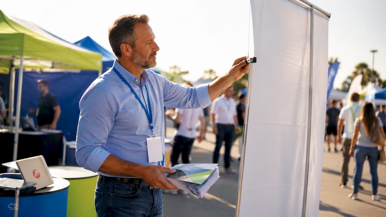
Pro Tip: Ask your print vendor for a digital proof or a physical sample before approving a full production run. Arrowhead Sign Company - Signs, Banners and Trade Show Displays ships most products within two business days, so a quick proof review still fits a tight event timeline.
What are the most common retractable banner design mistakes?
Even experienced marketing professionals make predictable errors when designing for large-format print. Knowing them in advance saves time, money, and the stress of a reprint the week before your event.
- Overloading the banner with text. A banner is not a brochure. If your display requires more than 30 words to communicate its message, the layout needs editing, not more space.
- Ignoring safe margins. Content placed too close to the edge gets cropped during production. The 25mm bleed standard exists for a reason. Keep all critical elements at least 50mm from any edge.
- Using decorative fonts for key information. Script fonts, display typefaces, and condensed fonts below 24 points become unreadable at trade show distances. Stick to clean sans-serif options for anything that needs to be read quickly.
- Poor color contrast. Matching your text color too closely to your background color is a readability failure. Test every text block against its background before submitting files.
- Submitting RGB files for print. RGB looks vivid on screen but shifts unpredictably when converted to CMYK at the printer. Design in CMYK from the start.
- Scaling up low-resolution images. Enlarging a 72 DPI web image to fill a banner panel produces visible pixelation. Source images at 150 to 200 DPI at the intended print size.
Before submitting any file, run a pre-flight check using Adobe Acrobat Pro or your design application’s built-in preflight tool. This catches missing fonts, RGB images, and incorrect dimensions before they become print problems. You can also print a scaled-down version at 25% size on a standard printer and tape it to a wall to simulate the viewing experience. Walk back eight to ten feet and assess whether the hierarchy reads clearly. This simple on-site walk test catches layout issues that screen review misses every time.
Key takeaways
Retractable banner design best practices require combining clear visual hierarchy, readable typography, high-resolution imagery, and correct print file setup to produce displays that perform at real events.
| Point | Details |
|---|---|
| Visual hierarchy first | Place your headline in the top third and limit the banner to one core message. |
| Two fonts maximum | Use a bold sans-serif for headlines and one clean face for supporting text. |
| Resolution at 150 to 200 DPI | Submit files at this range for sharp prints without slowing production. |
| CMYK with bleed | Design in CMYK, embed ICC profiles, and include 25mm bleed on all sides. |
| Test before production | Use the blur test, a scaled print, and a pre-flight check before submitting files. |
What I’ve learned from years of watching banners succeed and fail
After working with hundreds of event marketing teams, the pattern is consistent: the banners that perform best are almost always the ones that went through the most editing, not the most designing. The first draft is usually too busy. The second draft is closer. The third draft, after someone has been ruthless about cutting text and simplifying the layout, is the one that actually works on a trade show floor.
The technical side trips people up more than the creative side. I have seen beautifully designed banners arrive at events looking washed out because the designer worked in RGB and never checked the CMYK conversion. I have seen logos printed with visible pixelation because someone used a PNG from a website instead of requesting the vector file. These are not creative failures. They are process failures, and they are entirely preventable.
The trend I am watching in 2026 is a move toward extreme minimalism with one bold visual hook. Brands are stripping banners down to a logo, a single image, and five words or fewer. It sounds risky, but at a trade show where every competitor is cramming their banner with bullet points and product specs, a clean display with a single strong image stops people in their tracks. Pair that with a well-assembled retractable banner stand that keeps the graphic taut and wrinkle-free, and you have a display that looks intentional and professional from across the room.
The uncomfortable truth is that most banner design problems are not design problems at all. They are editing problems. Give yourself permission to cut more than you think you should.
— Dan
Get your retractable banners designed and printed fast
If you want professional results without the back-and-forth of managing design files and print vendors separately, Arrowhead Sign Company - Signs, Banners and Trade Show Displays handles the full process from design through production and delivery.
Most retractable banner stands ship within two business days, which means you can finalize your design, submit your files, and have a print-ready display in hand before your event without cutting corners on quality. Arrowhead Sign Company - Signs, Banners and Trade Show Displays also offers direct delivery to venues across Arizona, so your banners arrive where you need them, when you need them. Whether you are outfitting a single booth or a full trade show presence, the team brings the expertise to make your brand look its best on the floor.
FAQ
What resolution should a retractable banner file be?
Submit your banner file at 150 to 200 DPI at full print size. Files at 300 DPI are unnecessary for banners viewed from 8 to 10 feet and create large files that slow print processing.
How many fonts should a retractable banner use?
Limit your design to two font families. Use a bold sans-serif for headlines and one clean typeface for supporting text to maintain readability and a professional appearance.
What color mode should banner files be submitted in?
Submit all print files in CMYK color mode with embedded ICC profiles. RGB files converted without a managed workflow often produce dull, inaccurate colors in the final print.
How much bleed should a retractable banner include?
Include 25mm of bleed on all sides and keep critical content at least 50mm from any edge. This protects logos, text, and key graphics from being cropped during production.
What is the most common retractable banner design mistake?
Overloading the banner with too much text is the most frequent error. A retractable banner should communicate one core message clearly, not replicate the content of a brochure or data sheet.
Recommended
- Assembling Retractable Banner Stands Correctly - Arrowhead Sign Company
- Custom Pop Up Signs | Outdoor Banner Stands | Retractable Banner Stands | Arrowhead Signs and Displays
- How Outdoor Event Banners Are Made: a 2026 Guide - Arrowhead Sign Company
- What Is a Pull Up Banner? Your Complete Event Guide - Arrowhead Sign Company