

The Role of Signage at Expos: A Practical Guide
Posted by Deeder Dandenhorf on Jun 3rd 2026
The Role of Signage at Expos: A Practical Guide
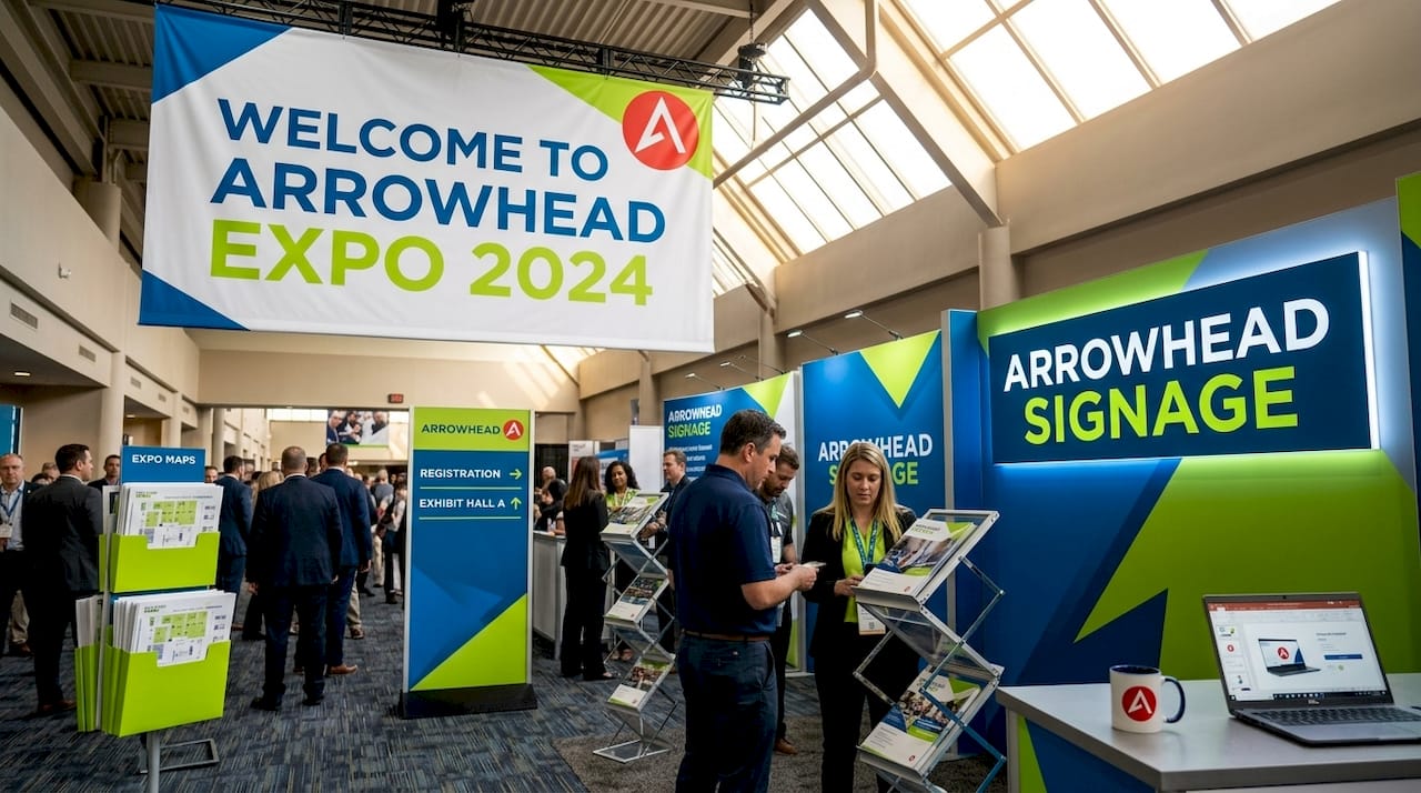
Expo signage is the primary visual tool that identifies your brand, communicates your core message, and guides attendees through complex event spaces. At a crowded trade show, you have roughly 3 to 5 seconds to capture a passing attendee’s attention before they move on. That window is not a design challenge. It is a business challenge. The role of signage at expos extends well beyond decoration. It determines whether your booth gets noticed, whether visitors understand your offering, and whether your brand earns the credibility it deserves in a competitive hall.
How signage improves visibility and attracts attendees at crowded expos
Visibility is the first battle at any expo. Your booth competes with dozens, sometimes hundreds, of neighboring exhibitors for the same pool of foot traffic. Signage is the mechanism that tips that competition in your favor.
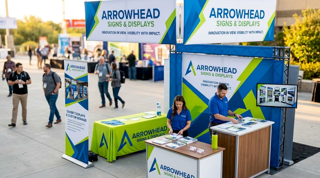
Height and placement are your most powerful visibility tools. Hanging banners and overhead signs position your brand above the visual noise of the floor, making your booth identifiable from across the hall. This matters especially in large convention centers where attendees scan the room before committing to a direction. A retractable banner stand placed at the front edge of your booth creates a visual anchor that draws the eye before a visitor even reads a word.
Bold graphics and clear branding create instant recognition. Effective trade show signage increases brand visibility, lead generation, and ROI by differentiating exhibitors through strong visual identity. That differentiation is not accidental. It comes from deliberate choices: a single dominant color palette, a logo placed at eye level, and a headline that states exactly what you do.
The most common signage types for expo booths include:
- Retractable banner stands: Portable, quick to set up, and ideal for front-of-booth placement
- Pop-up backdrops: Full-width displays that create a professional branded background for your entire booth
- Table covers: Branded fabric covers that extend your visual identity to every surface
- Hanging banners: Suspended overhead for maximum visibility from a distance
- Window and panel graphics: Modular pieces that fill booth walls with messaging and imagery
Large-format graphics increase booth presence but require more planning and higher costs. The tradeoff is real: bigger signs command more attention in competitive aisles, but they also demand more transport logistics and setup time. For small businesses, a combination of one high-impact backdrop and two retractable banners often delivers the best balance of visibility and practicality.
Pro Tip: Place your most important signage at standing eye level (approximately 5 to 6 feet high) and use a second piece overhead if your booth allows it. Attendees scan at eye level first, then look up when something catches their interest.
What is the role of signage in expo navigation and wayfinding?
Navigation signage is the category most exhibitors ignore and most event organizers underinvest in. That oversight directly affects attendee experience and, by extension, how long visitors spend at your booth.
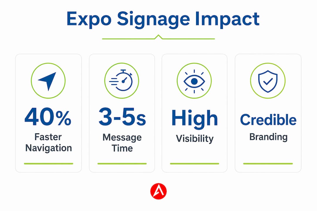
Optimized navigation signage improved wayfinding success and reduced time to find locations by 40% in eye-tracking research conducted by Neurons. That figure applies to retail environments, but the principle transfers directly to expo floors. When attendees can find what they are looking for quickly, they arrive less frustrated and more receptive to engagement.
The design principles for effective wayfinding signs are straightforward:
| Design Element | Why It Matters |
|---|---|
| High contrast text | Legible from 15 to 20 feet away without stopping |
| Consistent visual language | Attendees recognize your signage system across the floor |
| Uncluttered layout | One message per sign prevents cognitive overload |
| Strategic placement | Positioned at decision points, not midway between them |
One underappreciated challenge: competing signage near navigation signs can distract visitors and reduce navigation effectiveness. When a promotional banner sits directly beside a directional sign, the promotional piece often wins the visual competition. This is a visual hierarchy problem. Event organizers and exhibitors both need to manage sign placement deliberately to prevent their own promotional materials from undermining the navigation experience.
Pro Tip: If you are an event organizer, designate a clear visual language for wayfinding signs (a specific color, icon set, or typeface) and enforce a buffer zone around them. If you are an exhibitor, position your promotional signage so it does not block or visually compete with floor navigation markers.
How does signage influence brand perception and credibility?
Attendees make snap judgments about exhibitor credibility based on signage quality and design. Low-quality or unclear signage undermines trust even when the products or services behind it are strong. This is one of the most consequential and least discussed aspects of expo participation.
Think about what your signage communicates before anyone speaks to you. A pixelated logo printed on a wrinkled banner signals that you did not invest in your presentation. A crisp, well-lit backdrop with consistent fonts and colors signals that you take your brand seriously. Attendees draw direct inferences from those signals about the quality of your products and the reliability of your business.
Consistent branding across all signage elements reinforces identity. That means your table cover, banner stand, and backdrop should share the same color palette, typography, and logo treatment. Inconsistency, even subtle inconsistency, creates a sense of disorganization that erodes confidence. According to the UFI 2026 Global Exhibition Barometer, 13% of event organizers identified updating show look and feel with signage as a key enhancement priority. That number reflects a growing recognition that signage is part of the attendee experience, not a logistical afterthought.
Key credibility signals your signage should communicate:
- Professional print quality: No pixelation, color banding, or visible seams
- Brand consistency: Matching colors, fonts, and logo placement across every piece
- Clear value proposition: One sentence that tells visitors what problem you solve
- Contact or next-step information: A website, QR code, or social handle for follow-up
Visual professionalism also supports meaningful attendee engagement. When your booth looks credible, visitors are more likely to stop, ask questions, and share their contact information. The signage does not close the deal, but it opens the conversation.
What types of expo signage should you use for your booth?
Choosing the right mix of signage types depends on your booth size, budget, visibility goals, and how often you exhibit. There is no universal answer, but there is a practical framework for making the decision.
| Signage Type | Best For | Key Limitation |
|---|---|---|
| Retractable banner stands | Portable, frequent exhibitors | Limited display area |
| Pop-up backdrops | Full-booth branding impact | Larger to transport |
| Table covers | Completing the branded look | Low visibility from a distance |
| Hanging banners | Maximum floor visibility | Requires venue rigging support |
| Modular panel systems | Regular exhibitors needing flexibility | Higher upfront cost |
For small businesses exhibiting at multiple events per year, modular signage systems offer the best long-term value. You can reconfigure panels for different booth sizes and swap out individual pieces as your messaging evolves, without reprinting everything from scratch. For a first-time exhibitor with a 10-by-10 booth, a retractable banner stand paired with a branded table cover and a pop-up backdrop covers all three visibility zones: eye level, surface level, and background.
The signs every small business needs for trade shows typically include at least one vertical banner, one backdrop or panel display, and one table-level piece. That combination creates a cohesive visual environment without overwhelming your transport budget. If you are evaluating banner stand options, retractable models are the most practical for expos because they set up in under two minutes and pack into a carry bag.
For outdoor expos or events with open-air components, custom printed tents and outdoor banner stands add weather-resistant visibility that standard indoor displays cannot provide. The types of promotional backdrop displays available in 2026 include fabric tension systems, step-and-repeat frames, and curved pop-up structures, each suited to different booth configurations and brand aesthetics.
Best practices for designing expo signage that converts
Design is where signage strategy either succeeds or fails. A well-chosen signage type with poor design delivers weak results. The principles below apply whether you are designing a single banner or a full booth system.
- Lead with one headline. Your primary sign should communicate one clear message. “Custom Software for Healthcare Teams” outperforms “Innovative Solutions for Modern Businesses” every time because it is specific and immediately relevant to the right visitor.
- Use readable fonts at scale. Sans-serif typefaces like Helvetica, Montserrat, or Open Sans read clearly from 10 to 20 feet away. Script fonts and decorative typefaces lose legibility at distance.
- Prioritize contrast. Dark text on a light background or light text on a dark background. Avoid placing text over busy photographic backgrounds without a solid color overlay.
- Include one call to action. A QR code linking to a product demo, a free consultation offer, or a simple “Visit us at Booth 412” gives attendees a reason to engage beyond browsing.
- Limit text to three lines per sign. A focused message with one headline, one supporting point, and clear visuals achieves greater impact than a crowded layout. Attendees do not read paragraphs on signage. They scan.
- Test visibility before the event. Print a proof and view it from 10 feet away. If you cannot read the headline in under two seconds, the font is too small or the contrast is too low.
Color deserves special attention. Your brand colors should dominate, but they need to work in the context of the expo environment. If your brand palette is muted or pastel, consider adding a bold accent color to your call-to-action element so it stands out against neighboring booths. Pairing your signage strategy with impactful event branding principles ensures your visual identity works at every scale, from a 2-inch logo on a lanyard to a 10-foot backdrop.
Key takeaways
Signage at expos drives booth visibility, brand credibility, and attendee navigation. When designed and placed with intention, it is the single highest-impact investment a small business exhibitor can make before the event doors open.
| Point | Details |
|---|---|
| Signage captures attention fast | You have 3 to 5 seconds to communicate your brand before attendees move on. |
| Navigation signage reduces friction | Optimized wayfinding signs can cut location-finding time by 40%, improving attendee experience. |
| Quality signals credibility | Poor print quality and inconsistent branding reduce perceived trustworthiness before a word is spoken. |
| Match signage type to booth goals | Retractable banners suit portability; backdrops maximize brand impact; hanging signs win on distance visibility. |
| Simple design outperforms complex layouts | One headline, strong contrast, and a single call to action consistently outperform cluttered multi-message designs. |
Dan’s take on what most exhibitors get wrong about signage
Most exhibitors treat signage as the last item on the pre-show checklist. They finalize their product demos, book travel, and then order a banner two days before the event. That sequence is backwards. Signage is the first thing attendees see and the primary reason they stop or keep walking. It deserves the same planning time as your pitch.
The mistake I see most often is over-messaging. Exhibitors want to communicate everything: their product features, their company history, their awards, their social handles, and their tagline, all on one banner. The result is a sign that communicates nothing because the eye does not know where to land. One strong headline and one clear visual will always outperform a sign that tries to say everything.
Logistics matter more than most people admit. A beautiful backdrop that takes 45 minutes to assemble is a liability at a show where setup windows are tight. Test your setup at home before the event. Know your dimensions. Bring extra hardware. The exhibitors who look the most polished on show day are almost always the ones who rehearsed.
Finally, treat your signage as a living asset, not a one-time purchase. Review it after every show. Does the messaging still reflect your current offer? Did attendees respond to it? Small refinements compound over time into a booth presence that consistently outperforms the competition.
— Dan
Ready to make your next expo booth impossible to ignore?
If your current signage is not pulling its weight, Arrowhead Sign Company - Signs, Banners and Trade Show Displays has the products and expertise to change that. From retractable banner stands to custom pop-up displays and branded table covers, every product is built for professional impact and practical portability.
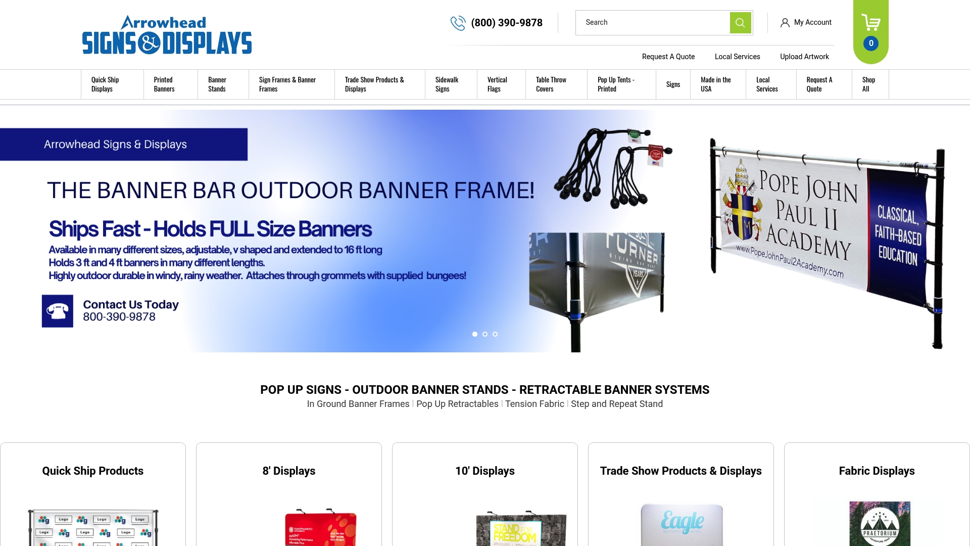
Most orders ship within two business days, and if you are in Arizona, Arrowhead Sign Company - Signs, Banners and Trade Show Displays offers direct delivery to your venue. Whether you are preparing for your first expo or refreshing a booth that needs a stronger presence, explore the full range of custom expo signage solutions and find the right fit for your booth size, budget, and brand.
FAQ
What is the role of signage at expos?
Signage at expos identifies your brand, communicates your core message within 3 to 5 seconds, and guides attendees through the event space. It directly influences booth traffic, brand perception, and lead generation outcomes.
What types of signage work best for trade show booths?
Retractable banner stands, pop-up backdrops, branded table covers, and hanging banners are the most effective types for trade show booths. The right mix depends on your booth size, transport needs, and visibility goals.
How does signage affect attendee navigation at expos?
Optimized navigation signage reduces the time attendees spend finding locations by up to 40%, according to Neurons eye-tracking research. Clear placement, high contrast, and a consistent visual language are the key design factors.
Why does signage quality matter for brand credibility?
Attendees make immediate judgments about exhibitor credibility based on signage quality. Low-quality or inconsistent signage reduces perceived trustworthiness even when the underlying product or service is strong.
How much text should expo signage include?
Expo signage should include one headline, one supporting point, and a single call to action. Crowded layouts with excessive text lose attendee attention because visitors scan rather than read at trade shows.