

Outdoor Event Signage Best Practices for 2026
Posted by Deeder Dandenhorf on Jun 12th 2026
Outdoor Event Signage Best Practices for 2026
Outdoor event signage best practices are the design and deployment standards that determine whether your signs get noticed, read, and acted on in open-air conditions. Effective outdoor signage combines the right letter sizing, weather-resistant materials, accessible wayfinding, and strategic placement to guide attendees and reinforce your brand. Whether you are organizing a music festival, a trade show, or a community market, the decisions you make about visual communication for events directly affect how smoothly your event runs and how professionally your brand is perceived.
1. Optimize text size and typography for distance readability
The 1-inch-per-10-feet rule is the starting point for every outdoor sign: one inch of capital letter height for every ten feet of viewing distance. In real-world conditions with glare, crowd movement, and visual distraction, scale that up 30 to 50 percent. A sign read from 50 feet needs letters at least 5 inches tall, and closer to 6 or 7 inches if the environment is noisy or bright.
Font choice matters as much as size. Sans-serif typefaces like Helvetica, Frutiger, and Arial maintain legibility at distance because they avoid the decorative strokes that blur when viewed from afar. Script and decorative fonts belong on printed programs, not on outdoor directional signs.
Letter spacing is an often-overlooked variable. Slightly loose tracking prevents individual letters from merging at distance, while tight tracking creates a wall of characters that reads as a blur from 30 feet away. Pair open tracking with high contrast: dark text on a light background, or white on deep navy or forest green, consistently outperforms low-contrast combinations in sunlight.
Pro Tip: Before your event, print a full-scale mockup and test it at the actual viewing distance on-site. This one step catches sizing errors that no screen preview will reveal, and it saves you from costly reprints on event day.
-
Use sans-serif fonts: Helvetica, Frutiger, or Arial
-
Minimum letter height: 1 inch per 10 feet, scaled up 30 to 50% for outdoor conditions
-
Contrast ratio: dark on light or light on dark, never mid-tone on mid-tone
-
Tracking: slightly loose to prevent letter merging at distance
-
Avoid all-caps for body text; use it only for short headlines
2. Select durable materials and weather-resistant solutions
The best material for your sign is the one that survives your specific event environment without losing visual quality. Powder-coated aluminum and steel resist rust and physical wear, making them the standard for permanent or multi-event outdoor frames. UV-stable vinyl maintains color fidelity through repeated sun exposure, while mesh banners allow wind to pass through rather than catching it like a sail.
Signage stability in wind is a practical concern that organizers frequently underestimate. Weighted bases, sandbags, and ground stakes are not optional accessories. They are safety requirements. Reducing copy on large banners also lowers wind load, which is a functional reason to keep your messaging concise.
| Material | Pros | Cons | Best Use |
|---|---|---|---|
| Powder-coated aluminum | Rust-resistant, durable, reusable | Higher upfront cost | Permanent frames, multi-event use |
| UV-stable vinyl | Vibrant color, cost-effective | Can tear in high wind | Banners, backdrops, event wraps |
| Mesh banner | Wind-resistant, lightweight | Slightly reduced print clarity | Large outdoor banners, fences |
| Corrugated plastic | Lightweight, inexpensive | Not suited for heavy weather | Short-term directional signs |
| Fabric (polyester) | Portable, wrinkle-resistant | Requires frame or stand | Pop-up displays, tent walls |
Pro Tip: Magnetic or reversible tile systems let you update sponsor names or schedules without reprinting the entire sign. For multi-day festivals, this flexibility pays for itself quickly.
Understanding how outdoor banners are constructed helps you ask the right questions when ordering, particularly around hem reinforcement, grommet placement, and substrate weight.
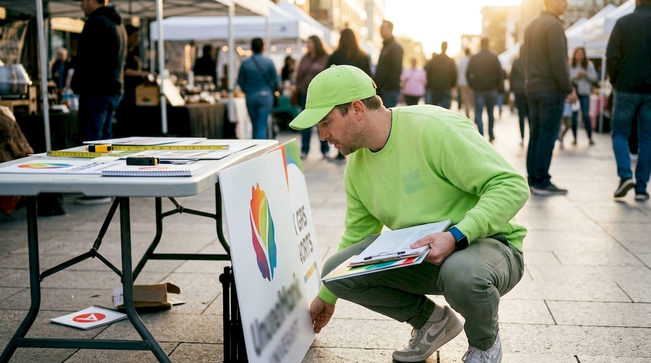
3. Design accessible wayfinding signage for outdoor events
Accessibility is a design requirement, not a finishing touch. Current accessibility standards call for a minimum 70% color contrast between text and background, mounting heights between 1,200 and 1,500 mm above the ground, non-glare finishes, and the International Symbol of Access at every accessible entry point. Meeting these standards protects your attendees and your event’s reputation.
Wayfinding signs belong at every decision point: every fork in a path, every entrance, every transition between zones. Consistent iconography across all signs reduces cognitive load. When an attendee sees the same restroom icon at every junction, they stop reading and start navigating instinctively. That is the goal.
Keep wayfinding and branding signage physically separate. A sign that tries to direct attendees to the first-aid station while also promoting a sponsor creates confusion at the exact moment clarity is most needed.
Wayfinding sign essentials checklist:
-
Directional arrows at every path junction and zone transition
-
Consistent icon set used across all signs (restrooms, exits, first aid, parking)
-
Minimum 70% contrast between text and background
-
Mounting height: 1,200 to 1,500 mm above ground level
-
Non-glare finish to reduce sun reflection
-
International Symbol of Access at all accessible entry points
-
Tactile or Braille elements where required by local regulation
The role of signage at expos and events follows the same logic: decision-point placement and consistent visual language are what separate a smooth attendee experience from a frustrating one.
4. Incorporate outdoor digital displays effectively
Outdoor digital signage requires at least 2,000 nits of brightness to remain visible in direct sunlight. A screen that looks vivid indoors becomes nearly unreadable at noon on a sunny festival day if it falls below that threshold. Brightness is the single most important specification to verify before renting or purchasing a digital display for outdoor use.
Weather protection is the second non-negotiable. An IP65 rating means the unit is fully dust-tight and protected against water jets from any direction. For outdoor events in unpredictable climates, IP65 is the minimum acceptable standard. Units with built-in media players reduce failure points compared to setups that rely on external devices connected via cables.
Here is a practical approach to managing digital signage content at events:
-
Schedule content in advance using the display’s built-in scheduling software
-
Set time-sensitive messages (session start times, sponsor spots) to rotate multiple times per day
-
Assign one team member as the on-site content manager with remote access to the player
-
Run a full diagnostic check the morning of the event before gates open
-
Refresh static content at least weekly for multi-day events, and update time-sensitive content several times daily
Pro Tip: Track dwell time near digital displays using a simple foot traffic counter. If attendees are not pausing, the content rotation is too fast or the placement is off. Adjust both before the next event.
5. Combine tent branding and supplemental signage for maximum impact
A branded event tent is your most visible asset from a distance. Tent canopy messaging should follow the same letter-height rules as any outdoor sign: large logos and short primary messages on the valance, with detailed information reserved for nearby standing signs or handouts. A tent that tries to communicate too much communicates nothing clearly.
Feather flags, retractable banners, and yard signs work as a system around your tent. Feather flags draw attention from a distance and mark your location from multiple angles. Retractable banners positioned at the tent entrance deliver your secondary message at close range. Directional yard signs guide attendees from parking areas or event entrances toward your booth. Each format has a specific job, and they work best when designed as a coordinated set rather than individual pieces.
Practical guidelines for tent and supplemental signage:
-
Tent valance: logo and one primary message, maximum 5 to 7 words
-
Tent back wall: secondary message or product lineup, readable from 10 to 15 feet
-
Feather flags: brand color and logo only, no body text
-
Retractable banners: call to action and contact information at eye level
-
Directional yard signs: arrow, location name, and distance only
For a detailed look at how pop-up display options compare across formats, the differences in portability, setup time, and print quality are worth reviewing before you commit to a configuration.
Key takeaways
Effective outdoor event signage requires the right combination of letter sizing, durable materials, accessible wayfinding, and coordinated branding to guide attendees and represent your event professionally.
| Point | Details |
|---|---|
| Letter sizing rule | Use 1 inch of letter height per 10 feet of viewing distance, scaled up 30 to 50% for real conditions. |
| Material selection | Match material to conditions: mesh for wind, UV vinyl for sun, aluminum for multi-event durability. |
| Wayfinding placement | Install directional signs at every decision point with consistent icons and 70% minimum contrast. |
| Digital display specs | Require at least 2,000 nits brightness and IP65 weather rating for any outdoor digital screen. |
| Tent branding discipline | Keep tent messaging to a logo and one short phrase; use supplemental signs for all secondary information. |
What I have learned from watching signage fail in the field
The most common mistake I see event organizers make is treating signage as a last-minute logistics task rather than a communication system. Signs get ordered late, arrive without field testing, and end up placed wherever there is an open pole or a spare table. The result is an event where attendees wander, miss sessions, and leave with a vague impression of the brand.
The fix is not complicated, but it requires doing a walkthrough of your venue before the event with a single question in mind: where does an attendee not know where to go? Those are your sign locations. Every hesitation point is a placement opportunity. I have seen events where adding three well-placed directional signs at a venue entrance reduced the volume of staff questions by a measurable amount, simply because attendees could orient themselves without asking.
The other thing I would push back on is the assumption that digital signage is always the premium choice. A well-designed, high-contrast vinyl banner on a powder-coated frame often outperforms a digital screen in direct sunlight, costs a fraction of the price, and requires zero technical support on event day. Digital displays earn their place for dynamic content and multi-day scheduling. For static directional information, print is still the more reliable medium in most outdoor conditions.
Plan your signage system the same way you plan your event program: with a clear hierarchy, assigned responsibilities, and a review step before anything goes live.
— Dan
Get custom outdoor event signage from Arrowhead Sign Company
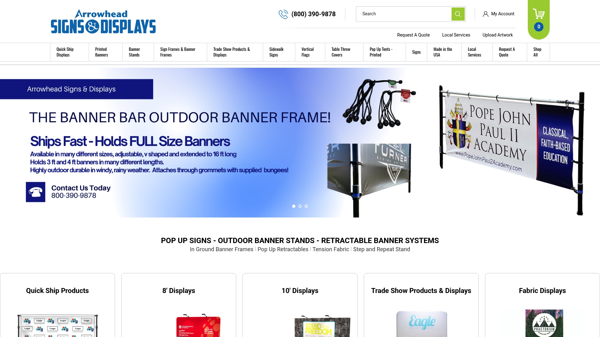
Arrowhead Sign Company - Signs, Banners and Trade Show Displays offers the full range of products you need to put these best practices into action. From retractable banner stands and custom pop-up signs to branded tents and outdoor banner stands, every product ships within two business days and is built for the demands of outdoor events. If you are in Arizona, Arrowhead Sign Company - Signs, Banners and Trade Show Displays also delivers directly to your venue. Whether you need a complete signage system for a festival or a single high-impact display for a trade show booth, the team is ready to help you get it right the first time. Reach out for a consultation and bring your event signage strategy to life with products that are built to perform outdoors.
FAQ
What is the standard letter height for outdoor event signs?
The standard is 1 inch of letter height per 10 feet of viewing distance. In real outdoor conditions with glare or crowd movement, increase that by 30 to 50 percent for reliable readability.
What materials work best for outdoor event signage?
UV-stable vinyl, mesh banners, and powder-coated aluminum are the most reliable choices. Mesh handles wind exposure well, vinyl delivers vibrant color at a lower cost, and aluminum frames provide durability across multiple events.
How bright does an outdoor digital sign need to be?
Outdoor digital displays require a minimum of 2,000 nits brightness to remain visible in direct sunlight. Look for an IP65 weather rating to protect the unit from dust and water.
Where should wayfinding signs be placed at outdoor events?
Place directional signs at every decision point: path junctions, zone transitions, and all entry points. Consistent iconography across all signs helps attendees navigate without reading every word.
How much text should a branded event tent display?
Tent valances should carry a logo and no more than 5 to 7 words. Detailed messaging belongs on nearby standing signs or handouts, where attendees can read it at close range without squinting.