

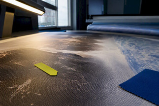
Designers: DPI for Large Banners, 200–300, 120–150, 70–100 PPI
Posted by Deeder Dandenhorf on Sep 24th 2026
Designers: DPI for Large Banners, 200–300, 120–150, 70–100 PPI

Set your resolution by viewing distance, not by habit. Close-view trade-show graphics typically need about 200 to 300 PPI at final size, mid-distance roll-up banners are usually fine at around 120 to 150 PPI, and large outdoor banners viewed from a distance often look sharp at roughly 70 to 100 PPI. Remember that “printer DPI” is a hardware spec, not your file resolution. Confirm your provider’s production profile before you export anything.
TL;DR:
- Use 200 to 300 PPI for close-view banners and graphics within three feet of viewers, but avoid applying 300 DPI universally to prevent unnecessarily large files.
- Check effective PPI in design software after scaling images to final size, as file metadata can be misleading and resampling often degrades quality.
- For outdoor banners viewed from ten feet or more, aim for 70 to 100 PPI to balance visual sharpness and file efficiency.
- Communicate with your print provider about their recommended formats, color profiles, and constraints to avoid delays and ensure accurate color and size.
- Understand that printer DPI describes ink placement capability, not your artwork resolution, so design with the appropriate PPI based on viewing distance rather than hardware specifications.
Table of Contents
- DPI for Large Banners: PPI Ranges by Viewing Distance
- How Do You Check Effective PPI Before You Export?
- What Belongs in Your File Setup Before You Send Art to Print?
- Why Doesn’t Printer DPI Determine My Artwork’s PPI?
- When Should You Stick With 300 PPI Anyway?
- What Should You Ask Your Print Provider Before Submitting Files?
- DPI vs. PPI: What’s the Actual Difference?
- How Does Low Resolution Actually Show Up on a Printed Banner?
- Does Viewing Distance Really Change How Sharp a Print Looks?
- Can You Upscale a Low-Resolution Image Without Ruining It?
- What Are the Most Common DPI Mistakes on Large Banners?
- What Actually Matters More Than Chasing a DPI Number
- Get Print-Ready Banners Without the Resolution Guesswork
- Where to Verify These Specs Yourself
- Sources
- FAQ
DPI for Large Banners: PPI Ranges by Viewing Distance
The single biggest mistake in banner file prep is treating 300 DPI as a universal law instead of a viewing-distance decision. Your eye resolves far less detail at 15 feet than it does at 15 inches, and that physical fact should drive every resolution choice you make.
Close viewing (0 to 3 feet), 200 to 300 PPI. This covers trade-show backdrops, table throw graphics, and anything a prospect will stand inches from while scanning a QR code or reading fine print. A 10 ft stretch fabric display at a booth falls squarely here, since attendees walk right up to it. Adobe’s guidance on PPI and DPI treats 300 PPI as the conventional high-quality benchmark for exactly this kind of close inspection, though 180 or 240 PPI often reads just as clean once you factor in typical viewing angles.
Medium viewing (3 to 6 feet), 120 to 150 PPI. Roll-up banners, lobby signage, and retail floor standees live in this range. Someone glancing at a roll-up while walking through a hallway isn’t inspecting pixel edges, so pushing every file to 300 PPI here just bloats your file size for no visible benefit.

Far viewing (10 feet and beyond), 70 to 100 PPI. Building-mounted banners, fence wraps, and large outdoor signage belong here. Print Industry’s resolution guidance tied to viewing distance confirms these three bands (close, medium, and far) as sensible starting points rather than fixed rules, and notes that wall or outdoor pieces viewed from a distance often work fine at 80 to 100 PPI.
Here’s how those ranges map to sizes you’ll actually order:
- A 24×36 inch trade-show poster viewed at arm’s length: target 250 to 300 PPI, meaning roughly 6,000 to 7,200 pixels along the long edge.
- A 96×24 inch roll-up or pop-up banner viewed at 3 to 6 feet: 120 to 150 PPI is plenty, so around 11,500 to 14,400 pixels wide.
- A 2×6 foot outdoor wall banner viewed from 10 feet or more: 80 to 100 PPI, or roughly 5,760 to 7,200 pixels across.
Push toward the top of each range when the artwork includes photography, gradients, or fine linework people will actually study. Drop toward the bottom when the design leans on bold type, flat color, and simple logos that survive lower pixel density without visible softness.
How Do You Check Effective PPI Before You Export?
The number your file metadata claims and the number your printer actually receives at final size are often two different things, and that gap is where most banner jobs go wrong.
In Photoshop: open Image Size (Image > Image Size), enter your final output dimensions in inches, and read the resolution field with resampling turned off. That figure is your true effective PPI at the size you’re printing, not the size you designed at.
In InDesign: open the Links panel, select the placed image, and check the “Effective PPI” column (or expand the link info). InDesign calculates this automatically based on how much you’ve scaled the image inside your layout, which is the number that actually matters.
The math behind both tools is simple: pixel dimensions equal inches times target PPI. A 48-inch wide banner section at 150 PPI needs 7,200 pixels across (48 × 150). If your source photo only delivers 3,600 pixels, you’re at 75 effective PPI regardless of what the file’s metadata claims.

Pro Tip: Never trust a file’s stated resolution. A stock photo can say “300 DPI” in its metadata while sitting at 40 effective PPI once you’ve scaled it to fill a 10-foot panel. Always check effective PPI after placement, not before.
Resampling won’t rescue a low-resolution source. Photoshop can interpolate a small file up to hit a target pixel count, but interpolation invents pixels rather than recovering detail, and the result usually looks soft or waxy at close range even though the numbers now “match.” If your source image can’t hit the target pixel count honestly, you have two better options:
- Split the artwork into panels and supply higher-resolution crops for the sections viewers will approach closely, keeping lower resolution for background areas.
- Request a partial-scale file setup from your printer, working at 50% size with proportionally adjusted PPI so your file stays a manageable size without sacrificing quality at the seams.
What Belongs in Your File Setup Before You Send Art to Print?
Clean file prep prevents the two most common delays in banner production: color surprises and last-minute font substitutions.
- Keep logos and type as vector. Illustrator or InDesign vector elements scale to any banner size with zero quality loss, while raster versions of the same logo will pixelate the moment you blow them up past their native resolution.
- Export as PDF/X-4 for most jobs. This format preserves live transparency, embeds color profiles, and is the standard most large-format print shops expect. Reserve flattened TIFF exports for jobs where your printer specifically requests them or where complex transparency needs to be baked in ahead of time.
- Convert to your printer’s CMYK profile before export, not after. Colors that look right in RGB or a generic CMYK profile can shift noticeably once they hit a wide-format printer’s actual ink set.
- Embed or outline every font. A missing font substitution on a banner the size of a garage door is not a small mistake, and it’s entirely avoidable.
- Build in bleed and respect the safe area. Most large-format jobs want at least half an inch of bleed, with critical text and logos kept well clear of any fold, grommet, or hem line.
- Flatten or manage transparency deliberately. Linked images with unflattened transparency effects are one of the most common causes of RIP errors on oversized files.
Following file-prep guidance for custom printed banners before you export saves a round trip with your print provider, and it’s worth doing even on a job you’ve run a dozen times before.
Why Doesn’t Printer DPI Determine My Artwork’s PPI?
A wide-format printer’s spec sheet listing “1440×1440 DPI” describes how finely the machine can place ink dots on the substrate. It says nothing about how many pixels your Photoshop file needs to carry.
Epson’s SureColor S60600 printer specifications list mechanical output resolutions like 1440×1440 DPI, and that figure reflects the printhead’s ink-dot addressing capability, not a target for your artwork’s pixel density. A printer can lay down 1440 dots per inch of a flat blue background just as easily as it can render a detailed photograph, because dot placement and image data are entirely separate layers of the production pipeline.
Printer DPI numbers describe how the machine deposits ink. Your artwork’s PPI describes how much visual information you handed it to work with. Confusing the two is the single most common resolution mistake in large-format print buying.
Rather than reverse-engineering a PPI target from a printer’s marketing spec sheet, ask your provider directly for their production profile: preferred file format, color profile, recommended quality mode, and maximum printable width. That single conversation replaces a guessing game with an exact answer, and it’s the same question worth asking whether you’re printing one banner or fifty.
When Should You Stick With 300 PPI Anyway?
Trade-show backdrops, step-and-repeat photo walls, and any graphic where a client or attendee will stand close enough to photograph small details are the cases where 300 PPI earns its cost in file size and processing time. These pieces get scrutinized, photographed, and posted online, so soft edges or visible pixelation reflect badly on the brand standing in front of them.
For very large step-and-repeat walls or oversized backdrops, a few practical habits keep quality high without making files unmanageable:
- Keep every logo and wordmark in vector form so paneling seams and scaling never introduce softness.
- Supply close-up crops of any section containing fine detail or small text for your printer to review before full production runs.
- Ask for a soft proof in the printer’s color profile, and request a physical large-format proof for anything mission-critical, like a branded event backdrop that can’t be reprinted the morning of the show.
- Panel oversized artwork into sections rather than working the entire piece at one uniform resolution, keeping detail-heavy zones sharper and background zones lighter.
The Imaging Spectrum best-practice notes on vector retention back this up directly: scaling a low-resolution raster image upward still looks soft even after you relabel its metadata to claim 300 PPI. Vector art sidesteps that problem entirely.
What Should You Ask Your Print Provider Before Submitting Files?
Author Dan has spent years reviewing production files for large-format signage and trade show graphics, and the recurring theme is always the same: the jobs that run smoothly are the ones where someone asked the right questions before hitting export.
A sign company specializing in trade show displays ships products quickly and offers direct venue delivery in Arizona, enabled by receiving production-ready files. That turnaround depends on designers checking a short list of items before submission.
Bring these questions to any print provider:
- What media are you printing on, and does that affect recommended PPI?
- What quality mode will you run this job in?
- What color profile should I convert to before I export?
- Are there RIP-specific constraints on file size, transparency, or format?
- What’s your maximum printable width, and will my artwork need paneling?
Asking upfront takes five minutes. Discovering the answer after a proof comes back wrong costs a full production cycle.
DPI vs. PPI: What’s the Actual Difference?
DPI and PPI get used interchangeably in casual conversation, but they measure two different things, and mixing them up is where most banner resolution confusion starts.
PPI (pixels per inch) measures how many pixels exist in your digital image per inch of output size. It’s a property of your file, and it changes the moment you scale an image up or down inside your layout software.
DPI (dots per inch) measures how many physical ink dots a printer lays down per inch on the substrate. It’s a property of the machine, fixed by its hardware, and it has nothing to do with how many pixels your source image contains.
Adobe’s explainer on DPI and resolution draws this distinction clearly: PPI is the image’s pixel density, while DPI refers to the printer’s mechanical dot output. A printer can lay down thousands of ink dots to render a single low-resolution pixel, which is part of why a soft image still prints as a soft image no matter how capable the machine is.
The practical takeaway is straightforward: when someone in a meeting says “make sure it’s 300 DPI,” they almost always mean 300 PPI in your file. Correcting that terminology in your own workflow prevents a lot of miscommunication with clients who use the terms loosely, and it keeps you focused on the number that actually determines print quality: your artwork’s pixel density at final size.
How Does Low Resolution Actually Show Up on a Printed Banner?
Pixelation on a large banner doesn’t look like the jagged little squares you’d see zooming into a low-res image on screen. It shows up as softness: blurred edges on text, muddy transitions in gradients, and a general “fuzzy” quality that’s hard to pinpoint but easy to notice from ten feet away.
Type suffers first and worst. Small text set in a low-resolution raster file (rather than live vector type) turns into a gray smear rather than crisp letterforms, because there simply aren’t enough pixels to define the edges of each character at that scale. Photography degrades more gradually. A slightly under-resolved photo might look fine at a glance, but fine details like facial features, product textures, or background elements will look soft compared to a properly resolved version sitting right next to it.
The distance factor cuts both ways here. A banner that’s technically under-resolved for its size can still look acceptable if viewers never get close enough to notice, which is exactly why the viewing-distance framework matters more than a flat DPI number. But if that same under-resolved file gets used for a close-view application, like a table throw cover or a sidewalk sign someone reads while standing next to it, the same pixel shortfall becomes obvious immediately.
The fix is almost always upstream of the print file. Once a low-resolution image reaches your printer’s RIP software, there’s no processing step that recovers detail that was never captured. Catching the shortfall during file prep, using the effective PPI checks covered earlier, is the only reliable way to avoid pixelation showing up on the finished piece.
Does Viewing Distance Really Change How Sharp a Print Looks?
Yes, and the effect is large enough that it’s the entire basis for the PPI ranges covered earlier in this guide. Human visual acuity has a physical limit: at a given distance, your eye simply cannot resolve detail finer than a certain angular size, no matter how good your eyesight is.
That’s why a banner printed at 90 PPI can look completely sharp mounted on a building facade and viewed from across a parking lot, while the same 90 PPI file would look obviously soft printed as a 24×36 poster meant to be read from two feet away. The pixel density didn’t change. The distance between the viewer’s eye and the print did, and that distance is what determines whether individual pixels become visible.
This is also why oversized artwork for billboards or building wraps can use surprisingly low PPI values, sometimes down around 15 PPI for pieces viewed from very far away, according to production discussions among large-format print professionals. It sounds counterintuitive until you consider that a billboard viewed from a highway at 60 miles per hour has no chance of revealing individual pixels regardless of resolution.
The practical rule: always design for the closest distance a realistic viewer will actually stand. A trade-show banner might get walked past at 15 feet by most attendees, but if even a portion of your audience will stop and read it from 2 feet away, design for that closer distance instead. Underestimating viewing proximity is a more common and more costly mistake than overestimating it.
Can You Upscale a Low-Resolution Image Without Ruining It?
Sometimes, within limits, but it’s worth setting expectations correctly before you try. Upscaling works best as damage control on an image that’s moderately short of your target resolution, not as a fix for a file that’s wildly undersized for its intended banner dimensions.
Photoshop’s Preserve Details 2.0 upscaling and dedicated AI upscaling tools have gotten meaningfully better at inventing plausible detail rather than just stretching existing pixels, and they can rescue an image that’s maybe 20 to 40 percent short of its target pixel count. Push much further than that, asking software to manufacture detail that was never captured in the original photo, and the results start looking synthetic: overly smooth skin textures, warped fine lines, or a slightly plastic quality that’s subtle on screen but obvious at banner scale.
A few practical guardrails make upscaling more reliable:
- Start from the highest-resolution version of the source file you can find; upscaling a already-compressed web image compounds quality loss rather than fixing it.
- Apply modest sharpening after upscaling, not before, since sharpening a low-resolution file first just emphasizes existing artifacts.
- Test a printed proof of the upscaled section before committing to a full production run, especially for anything viewers will approach closely.
- When the source photo is the centerpiece of a close-view banner, consider re-shooting or sourcing a higher-resolution replacement instead of relying on upscaling to carry the whole design.
Vector-based elements never need this conversation. Logos, type, and illustration work built natively in Illustrator scale infinitely without any upscaling risk, which is one more reason to keep as much of your banner design in vector form as the artwork allows.
What Are the Most Common DPI Mistakes on Large Banners?
Most banner resolution problems trace back to a small handful of repeated habits, and every one of them is avoidable with a five-minute check before export.
Applying 300 PPI to everything, regardless of size or viewing distance. This isn’t wrong so much as wasteful. It produces enormous file sizes, slower RIP processing, and no visible quality benefit on a banner nobody will view from three feet away.
Trusting a file’s metadata instead of checking effective PPI at placement. A photo labeled “300 DPI” in its file info can easily sit at 60 effective PPI once scaled into a 10 foot banner layout. The metadata number and the real number are only the same if you haven’t resized the image.
Converting raster logos instead of requesting or recreating vector originals. A pixelated logo is one of the most visible and most preventable errors on a finished banner, and it usually happens because someone grabbed a JPEG off a website instead of asking for the original vector file.
Skipping the conversation with your print provider about their production profile. Guessing at color mode, file format, and quality settings based on generic advice (including this guide) is always a weaker approach than asking your specific printer what they actually want.
Ignoring bleed and safe area until the proof comes back wrong. Text or logos placed too close to a grommet or hem line is a fixable problem that’s far cheaper to fix in the layout stage than after a physical proof has already been produced.
Catch these five issues before you hit export, and the vast majority of banner production delays disappear entirely.
What Actually Matters More Than Chasing a DPI Number
The conventional wisdom on banner resolution treats 300 DPI as a badge of quality, and that instinct causes more wasted file size and production delay than any actual print quality problem. The research here is consistent: viewing distance, not a fixed number, should drive every resolution decision you make.
What’s underrated is how much effective PPI checking gets skipped entirely. Designers trust a file’s metadata label instead of verifying pixel density at the actual placed size, and that single habit causes more soft, disappointing banners than any hardware limitation ever does.
Prioritize this order: figure out realistic viewing distance first, check effective PPI at final size second, and only then worry about vector retention and color profiles. A perfectly color-managed file built from an under-resolved source photo still looks soft. Get the pixel math right before you polish everything else, and ask your printer for their production profile instead of guessing. That one conversation solves more problems than any resolution chart, including this one.
— Dan
Get Print-Ready Banners Without the Resolution Guesswork
This company provides fast turnaround on orders, including quick shipping and local venue delivery options in Arizona.
If you’re prepping artwork for an outdoor installation, the Outdoor Banner Frame from the Banner Bar is built for exactly the 70 to 100 PPI outdoor scenario covered above, with a frame system that handles weather and wind without warping your graphic. For close-view trade-show applications where 200 to 300 PPI earns its file size, the 10 ft stretch fabric display gives attendees a booth backdrop that holds up under scrutiny from a few feet away. And for sidewalk promotion where foot traffic reads your message at medium range, the Signicade Deluxe A-Frame sidewalk sign fits the 120 to 150 PPI range without demanding oversized files.
Send your file over for a print-ready check before you commit to a full run. If it needs adjustment, you’ll hear about it before production starts, not after. Ready to move forward? Start your order on the printed banners page, where standard layout service and Next Day Air shipping are both available if your event is closer than you’d like.
Where to Verify These Specs Yourself
- Adobe’s guide to DPI and resolution explains the PPI versus DPI distinction directly from the software you’re already using to build your files.
- Print Industry’s viewing-distance resolution guidance confirms the close, medium, and far PPI bands referenced throughout this guide.
- Epson’s SureColor S60600 spec page shows what mechanical printer DPI actually looks like on a real production machine.
- Imaging Spectrum’s best-practice notes cover vector retention and why upscaled raster art still looks soft at scale.
- Print on demand quality guidance breaks down how submission workflows differ across production providers.
Sources
- Print Industry guidance on image resolution and viewing distance
- Epson SureColor S60600 printer specifications
FAQ
How many PPI do I need for a 24×36 inch poster?
Target 250 to 300 PPI for a 24×36 poster since it’s typically viewed from a few feet away or closer, which means roughly 6,000 to 7,200 pixels along the 36 inch edge. Check the effective PPI in Photoshop’s Image Size dialog or InDesign’s Links panel after placement, since scaling inside your layout changes the real number.
Is 600 or 1200 DPI better for printing a banner?
Neither figure applies to your artwork file. Those numbers describe a printer’s mechanical dot output, not the pixel resolution your image needs, and Epson’s printer specifications confirm hardware DPI is entirely separate from artwork PPI. Ask your provider for their recommended file resolution instead of comparing device specs.
What resolution do I need for a 2×6 foot banner?
A 2×6 foot banner viewed from 10 feet or farther works well at 80 to 100 PPI, putting your pixel count around 5,760 to 7,200 pixels across the 6 foot dimension. If the same banner will be viewed up close, such as at a trade show booth, push toward 150 PPI or higher instead.
Should I use 72 or 300 PPI for my file?
Use 300 PPI only for close-view applications like trade-show backdrops or table throw graphics that people will stand near, and never rely on very low PPI values commonly used for screens, which produce visibly soft results in any print application. Match your PPI to the realistic viewing distance covered earlier rather than defaulting to either extreme.
Does Arrowhead Sign Company check my file resolution before printing?
Yes, files submitted through Arrowhead Sign Company’s printed banners page go through a print-ready check as part of the standard banner layout service, priced at $35 one time. Next Day Air shipping is also available for an additional $10 when your event timeline is tight.