

Stop Judging Color on Screen. Pick Matte or Gloss Business Cards
Posted by Deeder Dandenhorf on Sep 27th 2026
Stop Judging Color on Screen. Pick Matte or Gloss Business Cards

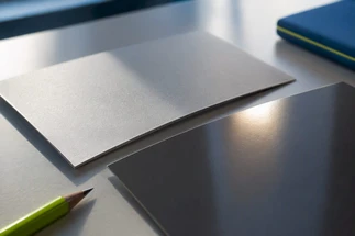
Choose matte for text-heavy, writable cards that get handled a lot, and choose glossy when your design leans on photos or bold color and needs to pop under event lighting. If you want both, spot UV lets you combine a matte base with glossy highlights. The right pick depends on how your card gets used, not just how it looks in a mockup.
TL;DR:
- Matte finishes are ideal for writable cards that are handled frequently, as they resist smudging and reduce glare, but may slightly mute color saturation.
- Glossy coatings enhance photo vibrancy, provide better moisture and scuff resistance, and work well for image-heavy or portfolio-type cards.
- Applying spot UV over matte or soft-touch bases creates impactful visual contrast, especially for logos or bold graphics, but requires careful design and proofing.
- Physical proofs are essential to confirm color accuracy and finish quality, as digital previews cannot fully replicate coated surface interactions.
- Recyclability varies with coating type; uncoated or lightly matte-coated stocks are more eco-friendly than laminated finishes incorporating plastic layers.
Table of Contents
- Matte vs glossy at a glance
- What matte finish actually does to your card
- What glossy finish actually does to your card
- How each finish changes color perception and print accuracy
- Durability and how each finish holds up over time
- Can people write on it, and will it scan clean?
- What production cost and turnaround actually look like
- Hybrid finishes: when spot UV earns its cost
- A simple framework for choosing your finish
- Common mistakes that ruin an otherwise good card
- Getting reliable results from proof to print
- Environmental impact and sustainability of each finish
- A closing take on picking the right finish
- How Arrowhead Sign Company can help you finish the job
- Sources
- FAQ
Matte vs glossy at a glance
Before you dig into the details, here is the quick version of how these two finishes stack up against each other.
- Color and finish: matte gives a soft, muted look with reduced glare, while glossy delivers punchier color and a mirror-like shine.
- Writability: matte and uncoated stocks take pen ink cleanly, but glossy surfaces resist ink and tend to smudge.
- Durability: glossy adds a protective layer against moisture and light scuffs, though fingerprints show up more on darker glossy backgrounds.
- Best for: matte suits consultants, law firms, and any card meant to be written on, while glossy suits photographers, restaurants, and brands built on vivid imagery.
Neither finish is universally better. The right call depends on your industry, your card’s job, and how often it gets handled between the box and the recipient’s wallet.
What matte finish actually does to your card
Matte coating is a thin, non-reflective layer applied over the printed stock. It works by scattering light across a slightly textured surface instead of bouncing it back in one direction, which is why matte cards never produce that mirror flash under fluorescent or stage lighting. Matte coatings scatter light through coarse pigments and diffuse reflection, a physical property that also explains why matte surfaces accept pen ink more readily than glossy ones.
That light-scattering effect comes with a trade-off in color. Matte finishes tend to mute saturation slightly and soften contrast, giving photos and bold graphics a quieter, more subdued look compared to the same design on glossy stock. For text-forward designs, logos, and minimalist layouts, that softness usually reads as clean and professional rather than flat.
Soft-touch laminate is matte’s more tactile cousin. It adds a velvety, almost rubberized feel to the surface, which makes a card feel more substantial in hand and signals a premium tier without shouting about it. Soft-touch works well for design studios, boutique consultancies, or any brand where the handshake moment matters as much as the printed content. It costs more than standard matte and takes slightly longer to produce, so it’s worth reserving for cards where texture is part of the brand story.

What glossy finish actually does to your card
Glossy coating smooths the printed surface to a near-mirror finish, which increases specular reflection instead of scattering it. Design experts note that matte coatings scatter light through diffuse reflection while glossy coatings smooth surface topography to boost that mirror-like bounce, and that physical difference is the root of nearly every practical distinction between the two finishes.
The upside of that smooth surface is color. Glossy finishes maximize color vibrancy and are the preferred choice for photo-heavy designs, since the coating locks in saturation and lets photographic detail read with more punch than the same image would show on matte stock. If your card doubles as a mini portfolio piece, gloss is usually the stronger visual choice.
Glossy coatings also add a layer of physical protection. That same source notes glossy finishes provide a protective barrier against moisture and minor scuffs that performs better than standard matte coatings, which matters for cards that live in a wallet, bag, or car console for weeks at a time. The tradeoff is visibility of fingerprints and smudges, particularly on darker glossy backgrounds where every touch leaves a faint mark.
How each finish changes color perception and print accuracy
Coatings do more than add shine. They change how the eye reads color, and the shift is measurable. Tests comparing coated and uncoated prints found average color differences of about 1.4 to 1.5 ∆E94 after coating, which is a small but visible shift, with maximums running higher in certain ink and stock combinations.

A ∆E94 shift of roughly 1.4 to 1.5 is often just noticeable to a trained eye, and the effect varies by ink density and stock. That’s a strong enough case for ordering a physical proof rather than trusting a monitor, since screens display color in RGB light while printed coatings interact with CMYK ink and paper fiber in ways no backlit display can replicate.
Technical print research backs this up directly. Coating types, especially film lamination, are shown to have the largest effect on dot gain and final color compared to uncoated stock, which is why the safest route is a coated contract proof rather than an uncoated placeholder. Before committing to a full run, request a small proofing sample on your exact stock and finish, and check it under the lighting you’ll actually use the card in, whether that’s an office, a trade show floor, or outdoor daylight.
Durability and how each finish holds up over time
A business card’s real test isn’t the first look, it’s the third month in someone’s wallet. Glossy stock generally resists moisture and light scuffing better than standard matte, thanks to that smooth protective coating, but it shows fingerprints and smudges more visibly, especially on dark or saturated backgrounds. Matte stock hides those fingerprints well but can pick up soft creases or a slightly worn look faster if it rides around loose in a pocket without a cardholder.
Handling frequency matters more than most people expect. A card handed out once at a networking event has different durability needs than one that sits in a rotating card wallet for months. Thicker stock, generally 16pt or higher, helps both finishes resist bending regardless of coating.
For upkeep, a soft cloth wipe removes light smudges from glossy cards without damaging the coating, while matte cards benefit from simply keeping them flat and away from sharp folds. Neither finish needs special cleaning products, but avoiding excess moisture protects the print on both.
Can people write on it, and will it scan clean?
Matte and uncoated stocks accept pen, pencil, and marker cleanly, which makes them the practical choice for cards meant to collect a note, a follow-up date, or a second phone number on the spot. Glossy surfaces resist ink absorption and are prone to smudging, so anything written on a glossy card risks smearing before it ever reaches a desk.
Glare is the other usability issue. Matte finishes reduce glare and improve legibility under bright overhead lighting, which matters directly for QR-code scanning, since a glare-heavy surface can confuse a phone camera trying to lock onto a code. If your card carries a QR code or gets used heavily at trade shows, test a sample under the actual booth lighting before printing the full run.
For event-heavy use, favor a writable back, thicker stock, and a matte or soft-touch face over glossy alternatives.
What production cost and turnaround actually look like
Small runs cost more per card than large runs on both finishes, since setup costs get spread across fewer pieces. Specialty finishes like spot UV, raised UV, or soft-touch lamination carry a surcharge over standard matte or gloss coating, and they typically add lead time because they run as a separate production pass after the base print.
If your timeline is tight, standard matte or gloss ships faster than any hybrid finish. Either way, order a small batch of samples before committing to a full print run, and budget a few extra days if you’re adding spot UV or raised UV on top of a standard finish.
Hybrid finishes: when spot UV earns its cost
Spot UV applies a high-gloss varnish to specific areas of an otherwise matte or soft-touch card, and it’s most effective when used over a matte or soft-touch base because the contrast between flat matte and glossy varnish is what creates the visual pop. A logo, a border, or a single word treated with spot UV reads as a deliberate design choice rather than a printing accident.
Design rules matter here. Production guidance recommends keeping spot UV at least 1.5 mm from trim lines to avoid registration issues, and avoiding very fine strokes that can fill in or blur during the varnish pass. Raised UV, a thicker variant, adds a tactile bump but needs even more margin for error around fine detail.
- Reserve spot UV for bold shapes, logos, or short text rather than fine linework.
- Combine soft-touch lamination with spot UV for a premium, dual-texture card that reads as high-end in hand.
Pro Tip: Request a sample with your actual logo before committing to a full spot UV run, since fine details that look fine on screen can fill in under the varnish.
For exhibitors who want a fast turnaround on this kind of finish, spot UV business cards can be produced on a quick-turn schedule without sacrificing the contrast effect.
A simple framework for choosing your finish
Run through these questions before you finalize your order.
- What’s the card’s primary job? Networking and note-taking favor matte, portfolio and photo display favor gloss.
- How often will it be handled? Frequent handling favors matte for its smudge resistance and a thicker stock for durability.
- Does the design lean on photography or bold color? Heavy photographic content favors gloss for saturation.
- Will people write on it? Any expectation of handwritten notes rules out glossy stock.
- Does it carry a QR code? Matte reduces glare and supports more reliable scanning under mixed lighting.
- What tone does your brand need? Matte reads subtle and premium, gloss reads energetic and image-forward.
Three quick profiles help translate those answers into a decision. A consultant or attorney handing out cards at meetings and expecting notes on the back fits matte or soft-touch. A photographer or restaurant owner whose card doubles as a visual sample fits glossy or spot UV over a photo. An exhibitor ordering 250 to 500 cards for a multi-day event with heavy handling and a QR code fits matte with a spot UV accent on the logo.
Pro Tip: Print a small test batch on your final stock choice and hand it around the office for a day before ordering the full run. The feedback on feel and legibility is more useful than any screen preview.
Common mistakes that ruin an otherwise good card
Most finish problems trace back to the same handful of errors. Judging color only on screen is the biggest one, since RGB previews never match how ink and coating interact on paper. Placing fine lines or small text under spot UV varnish causes them to fill in and blur. Running spot UV too close to the trim edge risks visible registration shifts. Laminating a heavily textured matte stock can trap air bubbles or create an uneven finish, and pairing a thin stock with a heavy coating leaves the card feeling flimsy despite the extra production step.
The fix for all of these is the same: brief your printer clearly on stock weight, finish, and any UV areas, then request a physical sample before the full run ships.
Getting reliable results from proof to print
Getting the finish right on the first run comes down to verifying physical samples rather than trusting digital mockups, since coatings shift color and texture in ways a screen can’t show. A proofing checklist that covers stock weight, coating type, and UV placement catches most production errors before they reach a full print run.
For exhibitors working against an event date, ordering 250 to 500 cards ahead of a show gives enough buffer to reprint if a sample reveals a color or finish issue. Requesting a small batch first, checking it under real lighting, and only then committing to the full quantity remains the most reliable way to avoid a costly reprint close to a deadline.
Environmental impact and sustainability of each finish
Coating type has a real, if often overlooked, effect on how recyclable a business card ends up being. Standard matte and gloss varnishes are typically water-based or UV-cured in thin layers, and most paper recycling streams can process cards with either coating without much issue. Laminated finishes, including soft-touch and some spot UV builds, add a thin plastic film that can interfere with paper recycling and, in many municipal systems, sends the card toward general waste instead of the recycling stream.
Uncoated stock remains the simplest option from a recycling standpoint, since there’s no film or heavy varnish layer to separate out. If sustainability is a priority for your brand, an uncoated or lightly matte-coated card paired with a heavier, higher-quality stock often reads as thoughtful without adding a plastic laminate layer. Recycled paper stock is available for either finish, though matte tends to show recycled fiber texture more visibly than gloss, which can actually reinforce a sustainability message rather than undercut it.
None of this means gloss or spot UV is off the table for eco-conscious brands. It means the choice is worth a quick conversation with your printer about which coating chemistry they use and whether the finished card is recyclable in standard paper streams, rather than assuming every finish behaves the same way once it’s in the recycling bin.
A closing take on picking the right finish
Match the finish to how the card gets used, not just how it looks in a mockup. Order a physical proof before committing to a full run, and if you’re unsure, request samples in both finishes and compare them side by side.
— Dan
How Arrowhead Sign Company can help you finish the job
Once you’ve settled on a finish, the rest of your trade show presence deserves the same fast turnaround. Many sign companies offer fast shipping options, and some provide local delivery to event venues in specific regions.
Beyond business cards, our catalog covers the booth materials that pair with them:
- Printed Banners for backdrops and signage, with a standard banner layout service at $35 one-off and Next Day Air available for $10 one-off.
- Banner Stands and EZ Tube Tension Fabric Displays for a polished booth backdrop.
- Quick Ship Displays and Pop Up Tents for fast-turnaround events.
If you’re coordinating card orders with a broader event timeline, working with a branding and design partner can help keep your finish choices consistent across every printed piece. Visit our full product catalog to request samples or check availability ahead of your next event.
Sources
For deeper technical detail on the claims above: the imaging library study on coating effects covers dot gain science, the spectrodensitometer color-shift analysis quantifies ∆E shifts, and the spot UV production guide details trim and stroke requirements. For general planning around event costs, this trade show booth cost breakdown offers useful context.
- Glossy vs Matte business cards
- Why ignoring dot gain could ruin your prints: how a spectrodensitometer can help
- Surface finishing effects on offset prints (imaging library)
- Spot UV & Raised UV Guide | Business Cards | ZIVFY
FAQ
What finish is best for business cards?
There’s no single best finish, since it depends on how the card is used. Matte or soft-touch works best for text-heavy, writable cards handled often, while glossy suits photo-driven designs that need strong color impact.
Does glossy or matte look more professional?
Neither finish is inherently more professional, since the perception depends on industry and brand tone. Design guides note that matte or soft-touch tends to read as subtle and premium for corporate and professional sectors, while gloss reads as energetic and image-forward for visually driven brands.
Is matte or uncoated better for business cards?
Matte adds a light coating that reduces glare and slightly softens color, while uncoated stock has no coating at all and offers the most natural writing surface. Uncoated is often the simplest choice for cards meant to be written on frequently, while matte gives a bit more polish with similar writability.
What is a common mistake people make with business cards?
The most common mistake is judging final color and finish only from a screen preview instead of a physical proof, since coatings shift color in ways monitors can’t show. Placing fine text or thin lines under spot UV varnish, or running UV too close to the trim edge, are close behind as frequent production errors.