


Proofing Custom Promotional Signage: A Small Business Guide
Posted by Deeder Dandenhorf on Jul 9th 2026
Proofing Custom Promotional Signage: A Small Business Guide

Proofing custom promotional signage is the process of systematically checking design files and print proofs to confirm accuracy, color fidelity, and print quality before a full production run begins. Done correctly, it prevents costly reprints, protects your brand reputation, and gives you confidence that your signs will perform at trade shows and events. Arrowhead Sign Company - Signs, Banners and Trade Show Displays works with small business owners who need their signage right the first time, especially when a two-day ship window leaves no room for do-overs. This guide walks you through every stage of the proofing process, from file setup to final inspection.
What file preparation steps ensure successful promotional sign proofing?
File preparation is the foundation of every successful proofing process. Errors introduced at this stage compound through every step that follows, so getting the file right before you submit it saves time and money.
Color mode: CMYK, not RGB
Your design file must be in CMYK color mode for print. RGB mode causes unpredictable color shifts, particularly with blues, greens, and oranges. That shift happens because RGB is built for screens, not ink. Converting from RGB to CMYK after the design is finished often produces muddy or washed-out results that look nothing like what you saw on your monitor.

Resolution by viewing distance
Resolution requirements depend on how far away viewers will stand from your sign. Large format print standards call for 100–150 DPI for close viewing, 50–100 DPI for medium distance, and 25–50 DPI for long distance. Web images saved at 72 DPI are never adequate for print. For close-up signs like sidewalk displays or table banners, images should be 300 DPI at final size to print sharply.
File preparation checklist
Use this checklist before submitting any file for a promotional sign:
- Color mode: Set to CMYK, not RGB
- Resolution: 150–300 DPI at final print size for close-viewing signs
- Logos: Use vector files (.AI, .EPS, .SVG) so logos scale without pixelation
- Fonts: Outline all fonts or embed them to prevent substitution errors
- Bleed: Add at least 0.125 inches of bleed on all sides
- Safe zone: Keep critical text and logos at least 0.25 inches inside the trim line
- Linked images: Embed all linked images before saving the final file
| File element | Requirement | Why it matters |
|---|---|---|
| Color mode | CMYK | Prevents color shift during printing |
| Image resolution | 300 DPI at final size | Produces sharp, clear output |
| Logo format | Vector (.AI, .EPS) | Scales without quality loss |
| Font handling | Outlined or embedded | Prevents font substitution |
| Bleed | 0.125 in. minimum | Avoids white edges after trimming |
Pro Tip: Always check your resolution at 100% zoom in your design program. A file that looks sharp at 25% zoom may be blurry at actual print size.
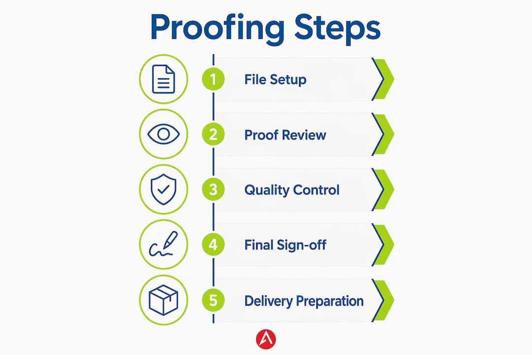
Reviewing your trade show printing workflow before submitting files helps you catch format issues that printers flag most often.
How do you review digital and physical proofs effectively?
Reviewing a proof is not the same as glancing at a PDF. A structured review catches the errors that cost you a reprint or, worse, embarrass your brand at an event.
Soft proofs vs. hard proofs
A soft proof is a digital PDF that shows layout, text placement, and general composition. Soft proofs work well for layout and text checks but cannot guarantee color accuracy. A hard proof, printed on the actual substrate, is the only reliable way to verify color for color-critical jobs. Color management standards like ISO 12647 and Fogra profiles help digital workflows, but physical proofs remain the final word on how ink looks on a specific material.
Step-by-step proof review process
- Check all text. Read every word out loud. Spell-check misses correctly spelled but wrong words, like “pubic” instead of “public.”
- Verify contact details. Phone numbers, website URLs, and addresses are the most common errors on promotional signs.
- Confirm logo placement and size. Make sure logos are not cropped, distorted, or placed too close to the edge.
- Review color against your brand standards. Compare colors to your brand’s Pantone or CMYK reference values, not just your screen.
- Check black text settings. Black text must be set to 100% K only, not rich black CMYK. Rich black on fine text causes blurring and misalignment.
- Inspect spacing and alignment. Look for uneven margins, misaligned elements, and text that runs too close to the bleed.
- View the proof under different lighting. Screen glare and warm office lighting can hide color problems. Check the proof in daylight or under a calibrated light source.
Pro Tip: Print a scaled-down version of your digital proof on a standard office printer. Seeing it on paper, even at reduced size, reveals spacing and text errors that screens hide.
For outdoor displays, reviewing outdoor signage best practices alongside your proof helps you confirm that your design choices hold up in real-world conditions.
What quality control checkpoints occur during and after production?
A well-structured production workflow with clear quality control gates at every stage significantly reduces errors and delays. Catching a defect early costs far less than catching it after the full run is complete.
In-process inspection points
Quality control does not start at the end of production. It runs throughout the entire process:
- Pre-production file review: Confirm color mode, resolution, bleed, and font embedding before the press starts.
- First-article inspection: Print one unit and compare it against the approved proof before running the full batch.
- Print defect check: Look for banding, nozzle errors, color variation, and ink saturation issues on early prints.
- Cut and trim inspection: Verify that cuts are straight, dimensions match the order, and no bleed content is trimmed incorrectly.
- Material condition check: Inspect the substrate for scratches, warping, or surface contamination before and after printing.
Final inspection checklist
| Inspection point | What to check | Pass criteria |
|---|---|---|
| Color consistency | Compare to approved proof | No visible color shift across units |
| Dimensions | Measure finished size | Within tolerance of specified dimensions |
| Surface finish | Check for scratches, bubbles | Clean, uniform finish |
| Text legibility | Read all text at normal viewing distance | All text clear and readable |
| Functionality | Test hardware (grommets, frames, stands) | All components secure and operational |
Common print defects include banding, color variation, misalignment, and surface damage. Early detection during production prevents costly reprints and keeps your event timeline intact.
Documentation and sign-off
Every approved proof needs a written record. Approving proofs in writing prevents disputes and protects both you and your printer if the final product does not match expectations. Keep a copy of the approved proof alongside the production sign-off for every order.
How do you avoid common mistakes in signage proofing?
The most expensive proofing mistakes are also the most preventable. Each one below has a straightforward fix.
- Relying on an uncalibrated monitor. Screen colors vary widely between devices. A monitor that has not been calibrated with a hardware colorimeter will show colors that do not match print output. Use a calibrated display or request a hard proof for any color-critical sign.
- Skipping the Pantone reference. If your brand uses Pantone colors, always provide the Pantone number to your printer. CMYK approximations of Pantone colors can drift noticeably, especially on fabric or vinyl substrates.
- Approving at the wrong scale. Reviewing a proof at thumbnail size hides spacing and resolution problems. Always review at 100% zoom for digital proofs and request a physical sample for large format signs.
- Overlooking rich black on text. Fine text printed in rich black CMYK blurs because the four ink channels do not register perfectly. Set all black text to 100% K only.
- Skipping a sample print for new materials. If you are ordering a new substrate, like a stretch fabric display or a rigid foam board, request a sample print before approving the full run. Colors and finishes behave differently on different materials.
Pro Tip: Build at least two business days into your event schedule for proof review and approval. Rushing this step is the single most common reason small businesses end up with signs they cannot use.
Checking your brand visibility checklist alongside your proof review helps confirm that your signage meets both print quality and marketing effectiveness standards.
Key Takeaways
Proofing custom promotional signage requires correct file setup, structured proof review, and documented quality control at every production stage to prevent reprints and protect your brand at events.
| Point | Details |
|---|---|
| CMYK is mandatory | RGB files cause color shifts; always convert to CMYK before submitting print files. |
| Resolution by distance | Use 100–300 DPI depending on viewing distance; 72 DPI web images are never sufficient. |
| Soft and hard proofs serve different purposes | Use digital proofs for layout checks and physical proofs for final color verification. |
| Black text needs 100% K only | Rich black CMYK causes blurring on fine text; set all black type to 100% K. |
| Written approval protects everyone | Document every proof approval in writing to prevent disputes and production errors. |
What I’ve learned from watching proofing go wrong at the worst moment
I’ve seen small business owners arrive at trade shows with signs that had the wrong phone number, a logo stretched out of proportion, or colors so far off from their brand that the booth looked like it belonged to a different company. Every one of those situations started with a skipped or rushed proof review.
The part that surprises most people is how often the error was visible in the digital proof. The business owner approved it without reading every word or comparing colors to a reference. The printer did exactly what was asked. The mistake was in the approval, not the production.
My honest advice: treat the proof review as seriously as you treat the event itself. Block time for it. Print it out. Read it backward if you have to. And never approve a proof on a phone screen or a laptop you have not calibrated.
Working with a signage provider that builds quality control into every production stage makes a real difference. Arrowhead Sign Company - Signs, Banners and Trade Show Displays ships most orders within two business days, which means the proofing window is tight and the process needs to be right from the start. That kind of turnaround only works when both sides, the client and the printer, take the proof seriously.
Plan your proofing time before you plan your booth setup. A sign that arrives correct is worth far more than one that arrives fast.
— Dan
Arrowhead Sign Company - Signs, Banners and Trade Show Displays: print quality you can verify
Getting your signage right before the event starts with a printer that supports the proofing process at every step.
Arrowhead Sign Company - Signs, Banners and Trade Show Displays offers a full range of customized promotional displays built for trade shows and events. The Signicade Deluxe A-Frame is a high-visibility sidewalk sign that ships with two prints included, giving you a practical way to test your design in a real display format. For larger booth presence, the Shasta 10 ft fabric display delivers a sharp, professional backdrop that rewards careful proofing with standout color and clarity. With most orders shipping within two business days and direct delivery available in Arizona, Arrowhead Sign Company - Signs, Banners and Trade Show Displays makes it easy to get quality signage on your timeline.
FAQ
What is proofing in custom signage design?
Proofing is the process of reviewing a design file or printed sample before the full production run to catch errors in text, color, layout, and resolution. It prevents costly reprints and confirms the final sign matches your brand standards.
What color mode should promotional sign files use?
All print files must be in CMYK color mode. RGB files cause unpredictable color shifts during printing, especially with blues, greens, and oranges.
What resolution do promotional signs need?
Close-viewing signs require at least 300 DPI at final print size. Large format signs viewed from a distance can use 50–150 DPI depending on how far away viewers will stand. Web images at 72 DPI are never sufficient for print.
What is the difference between a soft proof and a hard proof?
A soft proof is a digital PDF used to check layout and text. A hard proof is a physical print on the actual substrate and is the only reliable way to verify color accuracy before a full production run.
Why does black text need to be 100% K only?
Black text set to rich black CMYK uses all four ink channels, which can misalign slightly during printing and cause blurring on fine text. Setting black text to 100% K produces clean, sharp results every time.