
Designing Eye-Catching Booth Signage That Wins Attention
Posted by Deeder Dandenhorf on Jul 18th 2026
Designing Eye-Catching Booth Signage That Wins Attention
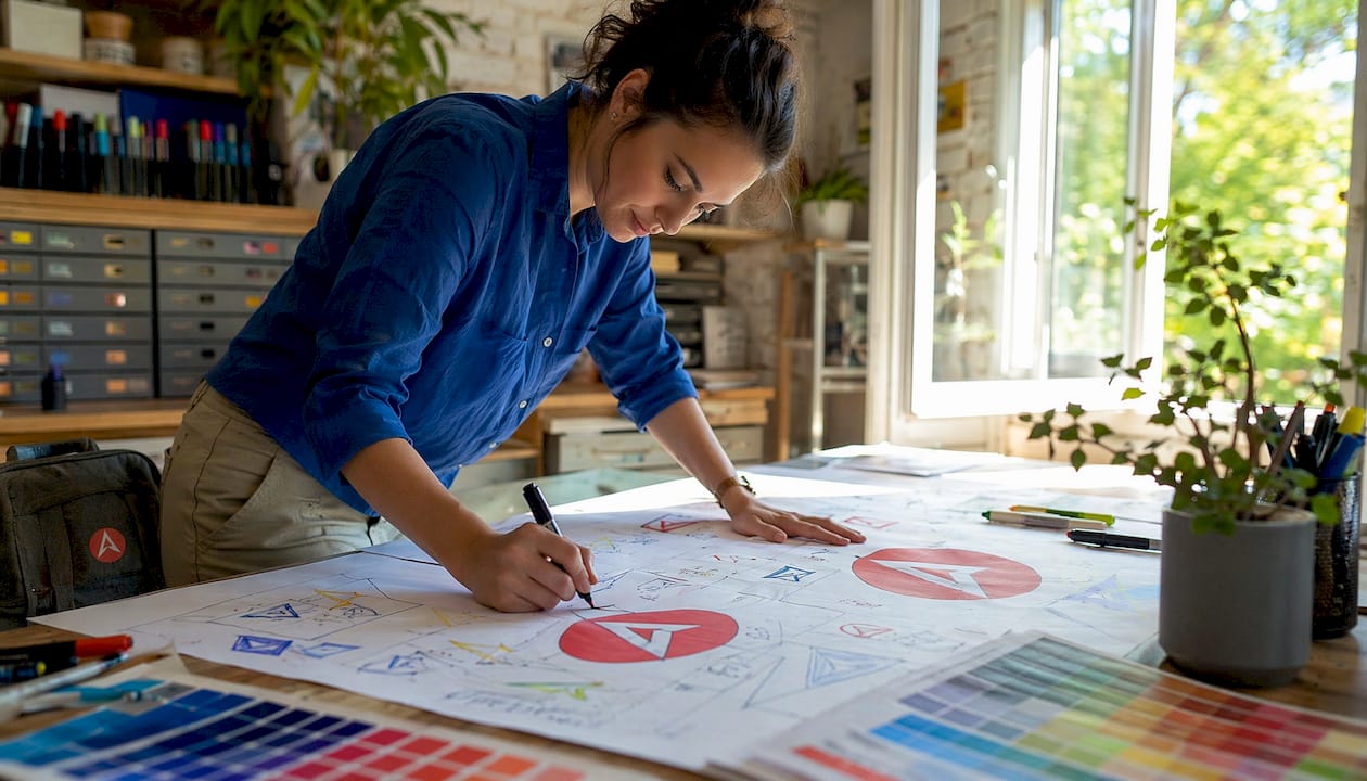
Designing eye-catching booth signage means creating clear, benefit-driven messages with high visibility that grab attention before a single word is spoken. Attendees give a booth just 3–5 seconds of attention before moving on. That window is your entire first impression. 46% of attendees say a booth’s visual appeal is the primary reason they decide to stop and visit. Professional exhibitors call this discipline “exhibit graphic communication,” and it combines typography, color science, and message hierarchy into a single glance-worthy display. Get it right, and your booth pulls traffic. Get it wrong, and even a great product goes unnoticed.
What makes booth signage visually effective?
The most effective booth signage leads with one benefit-driven headline of 5–8 words. That single line does the heaviest lifting. It answers the attendee’s unspoken question: “Why should I stop here?” Everything else on the sign supports that answer.
Text size is not optional. Use 1 inch of letter height for every 10 feet of viewing distance, which means headlines on a standard 10x10 booth backwall need letters at least 1.5–4 inches tall. Smaller text forces attendees to lean in, and most will not bother.
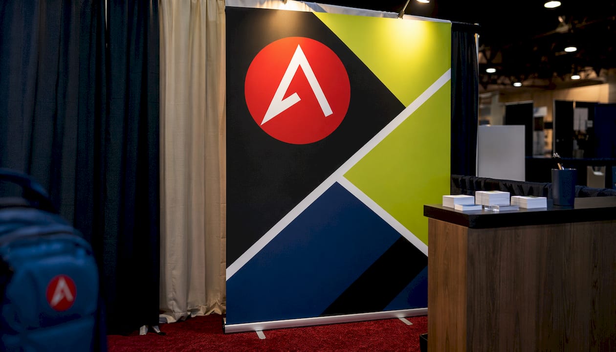
Color contrast is equally non-negotiable. Maintain a minimum 4.5:1 contrast ratio between text and background. Convention hall lighting is notoriously uneven, so run a grayscale test on your design before sending it to print. If the text disappears in grayscale, it will struggle under fluorescent overhead lights.
White space is a design tool, not wasted real estate. White space improves comprehension and directs the eye toward your key message. Crowded signs create visual noise, and attendees skip them entirely.
A few additional rules that separate professional booth display design from amateur work:
- Use sans-serif typefaces such as Helvetica, Futura, or Montserrat for body text. They read faster at a distance.
- Limit your design to two font families maximum.
- Use mixed case, not all caps. All-caps text slows reading speed by up to 13%.
- Place your most important text in the top two-thirds of the sign. Attendees standing in an aisle rarely look below waist height.
Pro Tip: Print a scaled-down version of your sign and tape it to a wall. Step back 10 feet and squint. If you cannot read the headline instantly, the font is too small or the contrast is too low.
What sign types and materials work best for your booth?
The right material depends on your booth size, budget, and how often you travel to events. Each format solves a different problem.
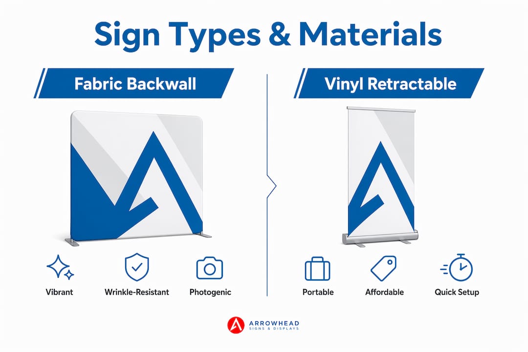
Fabric backwalls produce vibrant, wrinkle-resistant graphics and photograph well under event lighting. They pack into a carry-on sized bag and set up in minutes. Fabric is the preferred choice for 10x10 and 10x20 booths where a polished backdrop is the centerpiece.
Vinyl retractable banners are the workhorses of trade show booth branding. They are portable, affordable, and quick to swap out between events. A standard 33x80-inch retractable banner fits into a slim carry bag and stands independently without rigging.
Rigid panels made from foam board, PVC, or aluminum composite offer a premium, gallery-style look. They work well for product showcases and demo stations where durability matters more than portability.
Hanging signs require rigging permits and advance coordination with the venue, but they are visible from across the hall. They are worth the logistical effort for larger booths competing in dense exhibit floors.
Floor graphics guide foot traffic and create a branded path into your space. They work best as a secondary sign type, not a primary message carrier.
Here is a quick reference for matching sign types to common booth scenarios:
| Sign type | Best use case | Key consideration |
|---|---|---|
| Fabric backwall | 10x10 or 10x20 main backdrop | Lightweight, wrinkle-resistant, fast setup |
| Retractable banner | Secondary messaging, demos | Portable, easy to update between events |
| Rigid panel | Product display, counters | Durable but heavier to transport |
| Hanging sign | Large booths, high-traffic halls | Requires rigging permit and advance planning |
| Floor graphic | Directional, brand reinforcement | Pairs with other signs, not standalone |
One technical detail that exhibitors often overlook: vector graphics scale infinitely without losing quality, making them the correct format for logos and typography. Raster images need 100–150 DPI at final print size to avoid pixelation. Sending low-resolution files to a printer is one of the most common and costly mistakes in booth production.
How do you write signage messaging that attracts the right visitors?
Persuasive booth messaging starts with one question: “What is in it for the attendee?” Your headline must answer that question before the visitor takes another step. “We Help Retailers Cut Returns by 30%” outperforms “Welcome to Our Booth” every time.
Personalized signage tailored to specific buyer profiles increases engagement and helps visitors self-select. A booth serving both retail buyers and wholesale distributors can use two separate signs, each speaking directly to one audience. This approach reduces irrelevant conversations and improves the quality of leads.
Follow these steps to build messaging that works:
- Write your headline last. Draft your full value proposition first, then compress it to 5–8 words.
- Assign one message per sign. A sign trying to say three things says nothing.
- Use a single call to action. “Scan to book a demo” beats “Learn more, follow us, and visit our website.”
- Avoid industry jargon. If a first-year employee would not understand it, cut it.
- Align each sign with a buyer journey stage. Distance signs attract, proof signs build trust, and action signs guide next steps.
Signs matched to buyer journey stages create a natural flow through your booth. An attendee walking past sees your promise. One who slows down reads your proof point. One who stops gets a clear next step, whether that is a QR code, a demo request, or a product sample.
Pro Tip: Test your headline on someone outside your industry. If they cannot explain what you do after reading it once, rewrite it.
QR codes work well when they lead somewhere specific, such as a product video, a booking page, or a discount offer. A QR code that links to a generic homepage wastes the scan. Make the destination match the promise on the sign.
How should you place and arrange signs for maximum engagement?
Sign placement follows a three-layer hierarchy. The three layers are a distance-readable promise, a proof point, and a call to action, each assigned to a separate sign with one job. This structure prevents information overload and guides attendees through your booth naturally.
For a standard 10x10 booth, the right number of signs is fewer than you think. One strong backwall, one counter or demo sign, and one directional or QR sign is the recommended setup. Adding more signs beyond that creates noise and dilutes your message.
Placement guidelines that exhibitors consistently underuse:
- Position your backwall headline at eye level or above, visible from 20–30 feet away.
- Place your proof point sign at the booth entrance, readable from 10 feet.
- Put your call-to-action sign at the point of engagement, such as a demo table or counter.
- Never block your own signage with furniture, product displays, or staff.
- Avoid placing critical text near the bottom third of any sign.
Test your signage before the event opens. Walk the aisle at normal pace and note which signs you actually read. If your headline does not register in a single pass, something needs to change. Check your trade show display checklist before finalizing your setup to catch placement errors early.
Each sign should have one core job. A sign focused on a single message enables rapid comprehension during a brief glance. Splitting attention across multiple messages on one sign reduces the chance that any single message lands.
Key Takeaways
Effective booth signage combines a single benefit-driven headline, high contrast, correct text scale, and a three-layer placement hierarchy to convert a 3–5 second glance into a genuine visitor interaction.
| Point | Details |
|---|---|
| Headline brevity | Write headlines of 5–8 words that answer “what’s in it for me?” for the attendee. |
| Text scale and contrast | Use 1 inch of letter height per 10 feet of distance and a minimum 4.5:1 contrast ratio. |
| One job per sign | Assign each sign a single message to prevent overload and improve rapid comprehension. |
| Three-layer hierarchy | Use distance signs to attract, proof signs to build trust, and action signs to guide next steps. |
| Material selection | Match sign format to booth size, portability needs, and venue rigging requirements. |
What I have learned from years of watching booths succeed and fail
The exhibitors who get the most traffic are rarely the ones with the biggest budgets. They are the ones who made hard decisions early. They cut the second headline. They chose contrast over brand color. They printed one great backwall instead of six mediocre signs.
The most common mistake I see is messaging written for the exhibitor, not the attendee. A company name in giant letters tells me who you are. It does not tell me why I should care. The booths that stop me are the ones where the headline speaks directly to a problem I recognize.
Early planning matters more than most exhibitors realize. Finalizing your messaging two weeks before the show gives you time to proof, print, and test. Rushing a design to print the night before means you skip the grayscale test, the distance check, and the proof review. Those shortcuts show up on the floor.
I also think exhibitors underestimate the value of a well-placed A-frame sidewalk sign near the aisle. It is a low-cost, high-visibility tool that most booths ignore. A single A-frame with a sharp headline and a QR code can pull in foot traffic that your backwall never reaches.
Budget allocation is worth a direct opinion: spend more on your primary backwall and less on decorative elements. Attendees remember your message, not your table runner.
— Dan
Professional signage solutions from Arrowhead Sign Company
Your booth signage deserves the same attention you give your product. Arrowhead Sign Company - Signs, Banners and Trade Show Displays offers a full range of custom trade show displays built for exhibitors who need quality without the wait.
From retractable banners and fabric backwalls to the Signicade Deluxe A-Frame sign, every product ships within two business days and is built to perform under real event conditions. Arizona exhibitors also benefit from direct venue delivery. Whether you are preparing for your first trade show or refreshing a full exhibit, Arrowhead Sign Company - Signs, Banners and Trade Show Displays brings the expertise and speed your timeline requires. Reach out today to discuss your booth signage needs and get a custom solution that works.
FAQ
How long do attendees look at a booth sign?
Attendees give a booth just 3–5 seconds of attention. Your headline must communicate your core value within that window.
What font size should trade show signs use?
Use 1 inch of letter height for every 10 feet of viewing distance. For a typical trade show aisle, that means headlines between 1.5 and 4 inches tall.
How many signs does a 10x10 booth need?
One backwall, one counter sign, and one directional or QR sign is the recommended setup for a 10x10 booth. More signs create clutter and split attendee attention.
What contrast ratio makes booth text readable?
A minimum 4.5:1 contrast ratio between text and background keeps signage legible under convention lighting. Run a grayscale test on your design before printing to confirm readability.
What file format should I use for booth sign graphics?
Use vector files for logos and typography, since they scale without quality loss. Raster images must be 100–150 DPI at print size to avoid pixelation on large format prints.